The Responsive Theme gives you various options to fully customize the look and feel of your single product pages.
From adjusting content width and image display to reorganizing product details, sidebars, and floating bars, you have complete flexibility to design product pages that are both user-friendly and conversion-focused.
So, let’s explore the various settings.
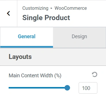
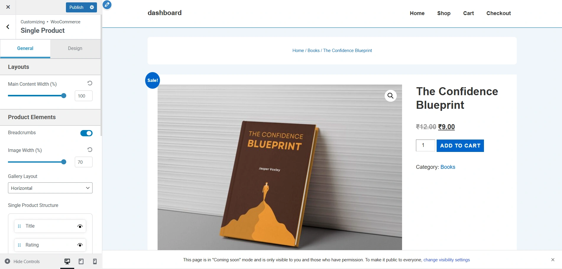
This is how the single product page looks now. These are the default settings.
Now, if you decrease the main content width to 65%, the content width considerably shrinks like so.
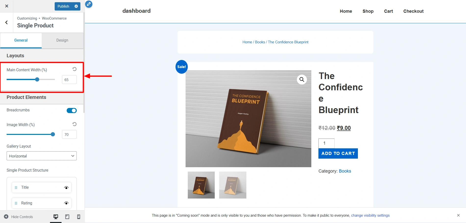
Now this is how the single product page looks at the moment.

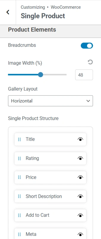
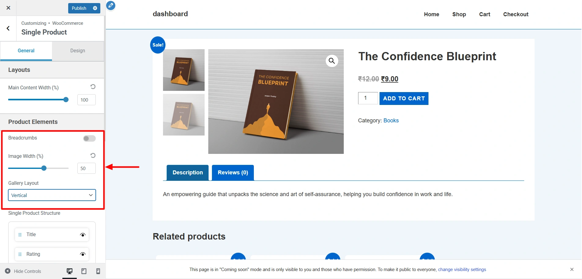
If I disable the Breadcrumbs, decrease the image width to 50%, and change the gallery layout to Horizontal, it would appear like this.
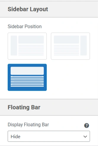
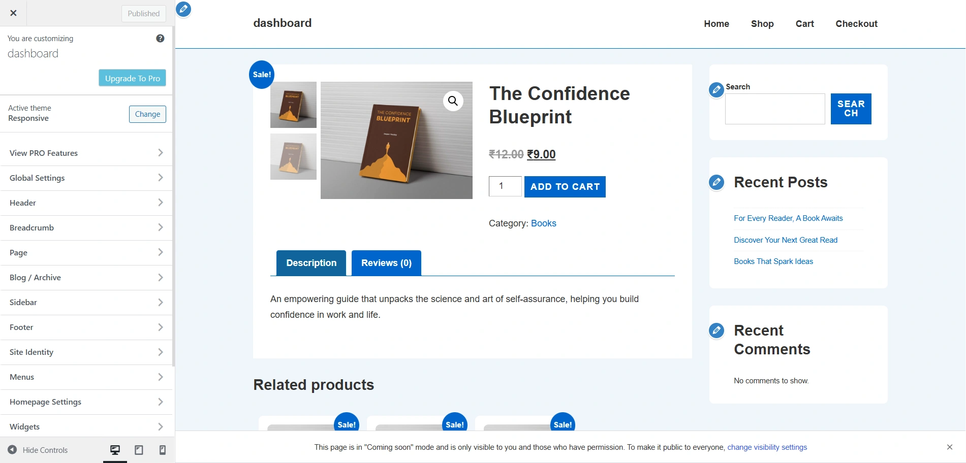
Since the default layout setting of the sidebar on the single product page is None, I have changed it to Right, and this is how it appears.


