Summary
You can show or hide WordPress blocks based on screen size by using responsive settings in the block editor or a plugin like Responsive Blocks.
This allows you to control block visibility for desktop, tablet, and mobile devices, helping you optimize layout, improve user experience, and display relevant content on each screen.
Are you wondering how to show or hide WordPress blocks based on screen size?
Wonder no more!
Displaying blocks based on screen size is an essential feature that you can use for various purposes.
For instance, if you have a plumbing website and want to use a block to show the contact details, but for mobile users, you want to place a CTA button in the same place. Using this feature, you can hide the contacts block for mobile users but still show them to website users.
Or, while building a WordPress website, you might encounter a situation in which a block looks good on one device but not on the other. Deleting the element block might not be the best solution to your problem. Hiding the WordPress block might come in handy in this situation.
This article will guide you through how to display WordPress Blocks while building your website.
Remember to read through the end.
Responsive Blocks is the Best WordPress Blocks Plugin – Get it for free!
What Does Show/Hide WordPress Blocks Mean?
Show/hide WordPress blocks based on screen size lets you specify which blocks to display on desktop, tablet, or mobile.
Instead of removing content from the website that does not look good on larger or smaller devices, you can hide the block on those devices while showing it where it is intended to be seen.
This is helpful when you are building responsive websites since each device has a different screen size, layout, and user behaviour. By adjusting which block is visible, it ensures that the content is being read and improves the user experience.
Common Use Cases
- Devices with CTAs: You may have a full contact form displayed on a desktop but just want to show the call button on a mobile device.
- More efficient mobile use: Hide large images, banners, or very complex sections of a website to avoid cluttering a user’s mobile screen.
- Prioritize content: Keep only the most important information on the mobile device, providing users with access to detailed information available only on a desktop device.
- Optimize design: Some layouts look great on desktop, but as devices get smaller, they break down. By hiding blocks of those layouts, you maintain an attractive website.
Use of the show/hide function allows the creation of a flexible, user-friendly website that meets the same design intent or provides the same content as a site with no added flexibility.
Why Show/Hide WordPress Blocks Based on Screen Size
Building an intuitive website requires a good theme and page builder, but its design matters equally.
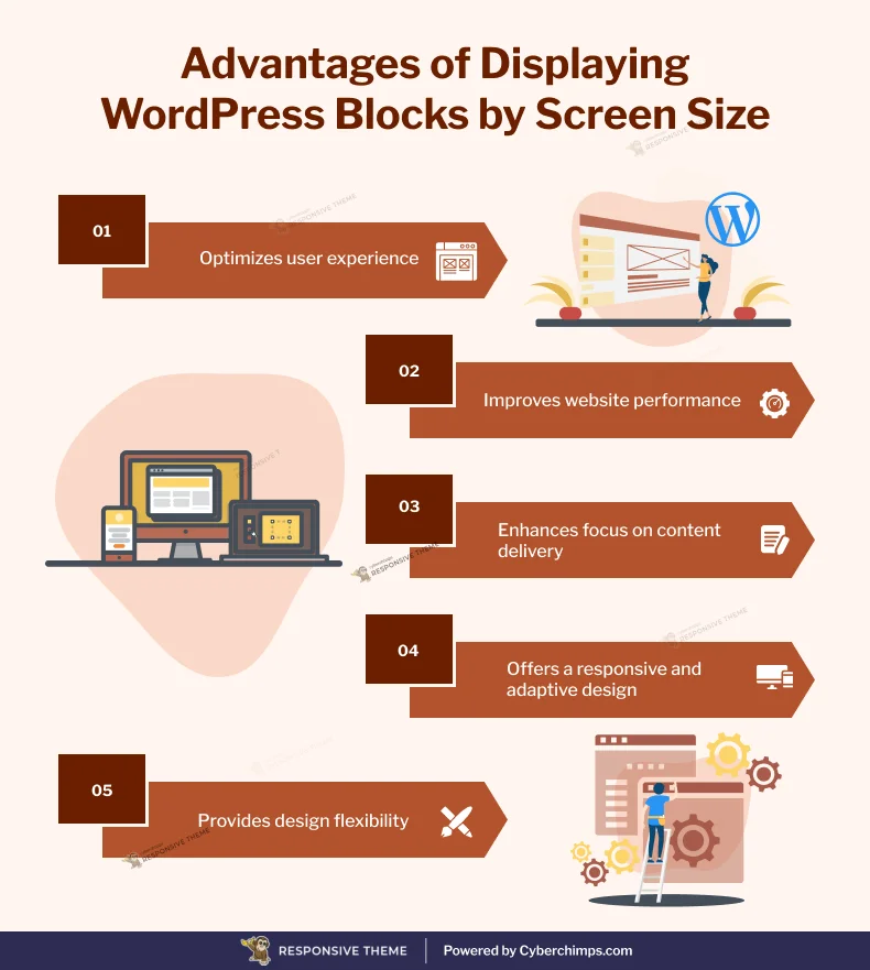
Displaying WordPress Blocks based on the screen size can help you in various ways:
1. Decluttering your web pages
The difference in size, resolution, and orientation of devices can greatly impact their appearance and performance. Hiding the cluttering blocks can make your website look clean and increase its overall usage.
2. Enhancing User Experience
Customizing the content and layout of your WordPress blocks can help fit the screen size of your user’s device. For example, you can display a simplified version of the block on mobiles to improve readability and navigation while keeping it different for a desktop or tablet.
3. Improving website speed
Stuffing content and blocks into small displays reduces page speed and increases loading time. Displaying Blocks according to their screen size can enhance page speed and save unnecessary data transmission.
4. Highlighting Content
You must display the most specific and important content on smaller devices to ensure it is accessible to users. For mobiles, you might also highlight specific content like the app download button or any other call-to-action button that might be irrelevant on a desktop.
5. Design Flexibility
Depending on the screen size, different design methods may be required to maintain its visual appeal and usability. Displaying WordPress blocks based on screen size allows you to customize your website’s layout and design for each device, offering a more personalized experience for users.
Now that you know why you should display blocks based on screen size, let’s dive into how to show/hide WordPress blocks.
How to Show/Hide WordPress Blocks
To go ahead, you can use any WordPress theme, but for better website performance, we recommend using the Cyberchimps Responsive theme.
Let’s look at how you can show or hide WordPress blocks based on screen size.
The first step is to install the Cyberchimps Responsive Blocks plugin.
???? My Real-World Test Results:
- Powered by Flexbox Container technology
- Number of blocks: 50+
- GTmetrix Performance Score: 98%
- Extensions like Animation, Display Condition, Responsive Condition and more
- Save design time with 100+ Premium-grade Starter templates
[Note: You can change the display of WordPress blocks only if you are using Gutenberg Responsive Starter Templates.]
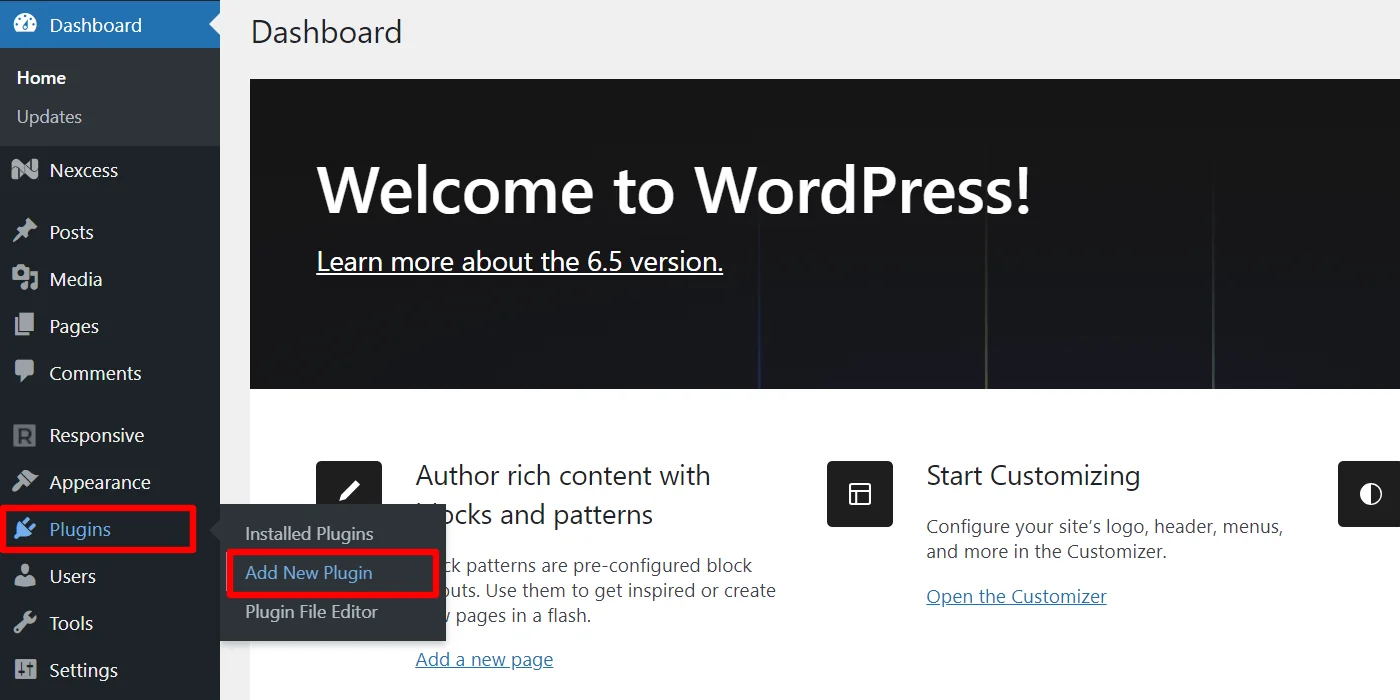
To install the Responsive Blocks plugin, navigate to your WordPress admin dashboard and click Plugins>Add New Plugin.
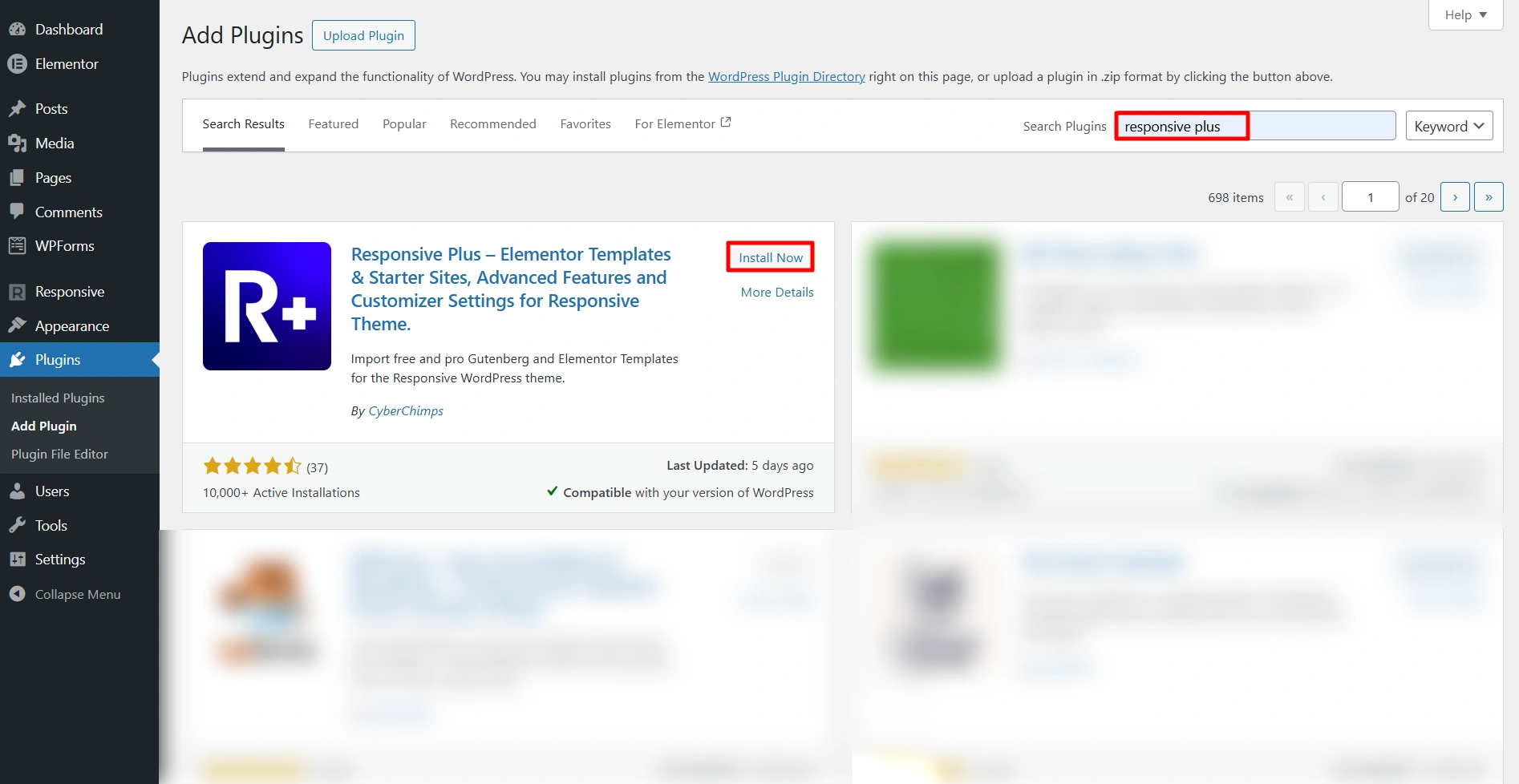
Next, search for Responsive Blocks and click Install Now. After installation, Activate the plugin.
Identify the blocks you want to hide.
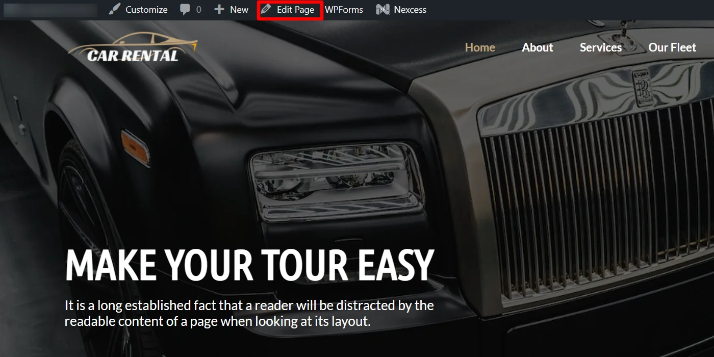
You can choose any template, but here, for tutorial purposes, we’re choosing the Car Rental template.
On the homepage, the section “MAKE YOUR TOUR EASY” looks fantastic on desktops and tablets, but it’s unnecessary on mobile and detracts from the main call to action.

In the steps below, you will understand how to remove such blocks from your website and customize them accordingly. So, let’s get started.
Visit the page where you want to hide blocks, and from the top menu bar, click on the Edit Page tab.
Next, select the block you want to hide.
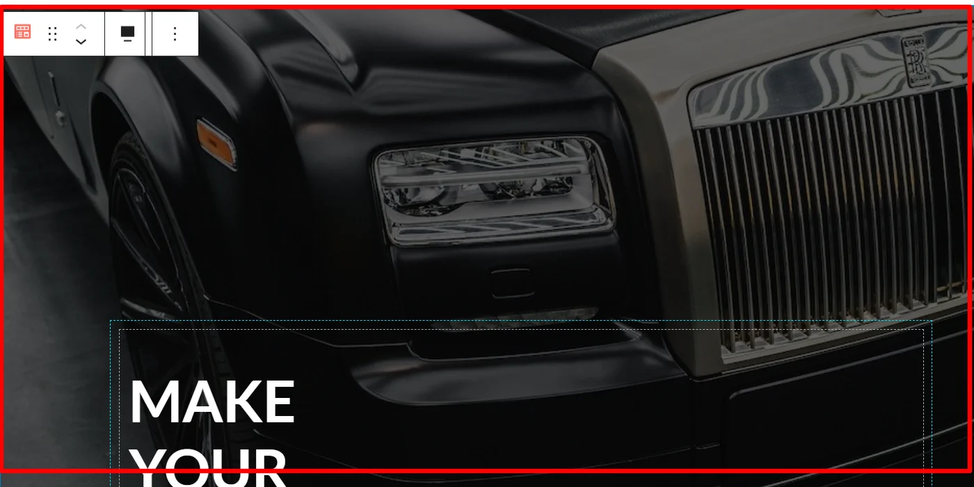
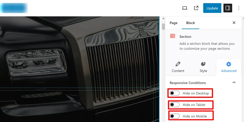
On the right side of the page, you will be able to see the options to edit block. Click on the Advanced tab.
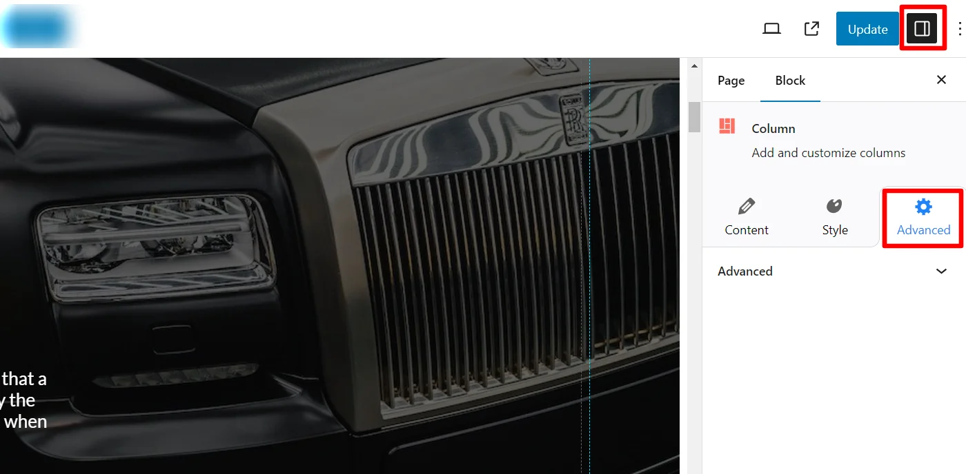
Next, click on the Responsive Conditions dropdown.
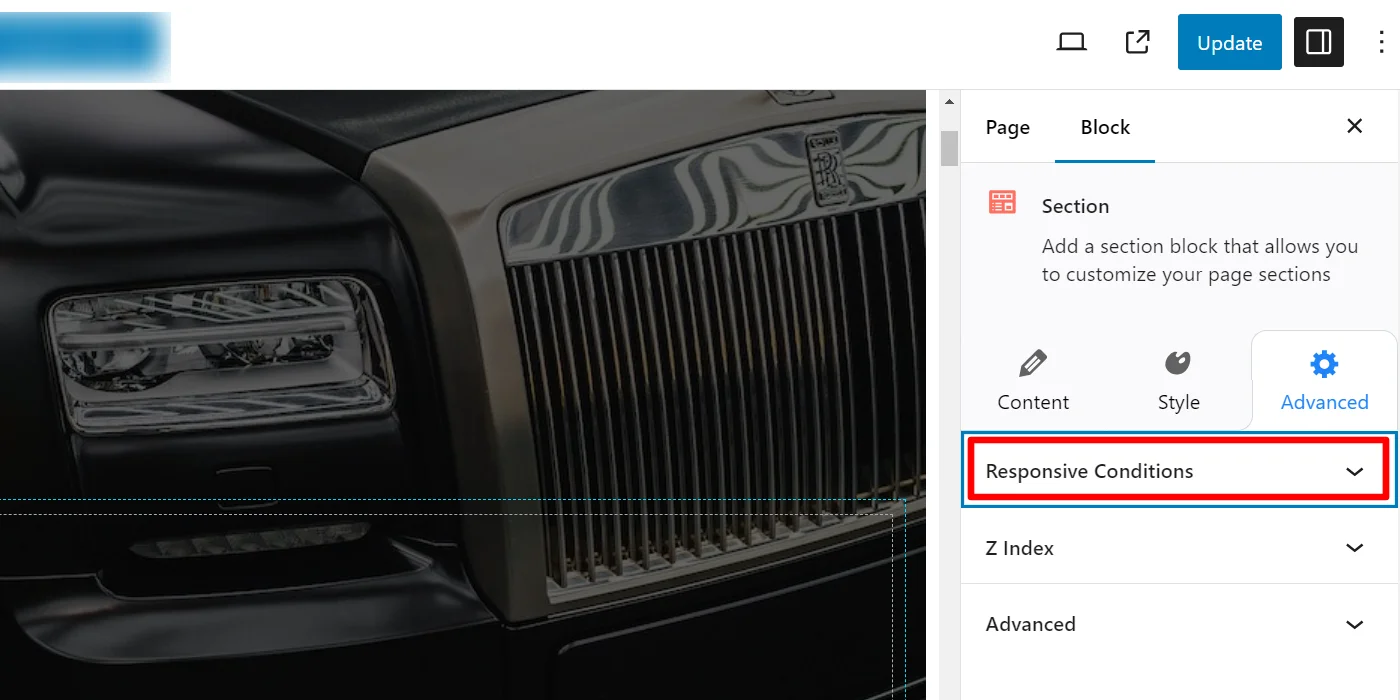
You can now see the options to hide the block on different devices. Toggle Hide on Desktop/Tablet/Mobile as required and update the page.
Switch on the toggle for hide in mobile and save the changes.
Following the above instructions, you can show/hide any WordPress blocks on your website based on the screen size.
FAQ
Yes, by default, WordPress Gutenberg has limited responsive controls. You typically need a plugin like Responsive Blocks to hide or show blocks for different screen sizes.
For this, you need to edit the page, select the block, go to Advanced settings, select the Responsive Conditions, and toggle the option to hide the block on mobile.
No, hidden blocks generally don’t negatively impact SEO as long as important content is still accessible and not misleading to users or search engines.
Conclusion
Showing or hiding becomes an integral part of your website when you want to display certain items to specific devices. In such cases, using Responsive Blocks plugin plays a key role to helps you show or hide WordPress Blocks.
You must make sure to keep your website design appealing to all screen sizes to avoid losing traffic.
Decluttering pages and optimizing the content for multiple devices can help you make your site visually pleasing. It also ensures accessibility and functionality across platforms.
If you liked this article, you can also read:
- How to Import Readymade Section Blocks in Elementor
- How to Build Free Landing Pages in WordPress
- How to Add a Gutenberg Popup Block in WordPress
Want to show/hide Gutenberg Blocks in WordPress, grab the Responsive Blocks plugin now!