The Responsive Theme has a built-in header builder.
Users can create their own custom headers for all devices without writing any code. While customising you can view how it looks on your desktop, a tablet or mobile phone and make adjustments to each layout individually.
Before you start:
- Make sure you have installed and activated the Responsive theme for your WordPress account.
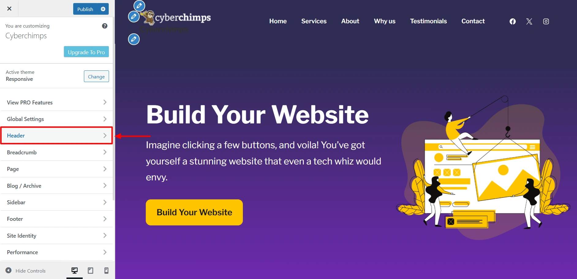
- From the WordPress admin dashboard navigate to Appearance > Customize, which will open the Responsive Theme WordPress live customizer.
- In the customizer select Header.
Editing the Mobile Header
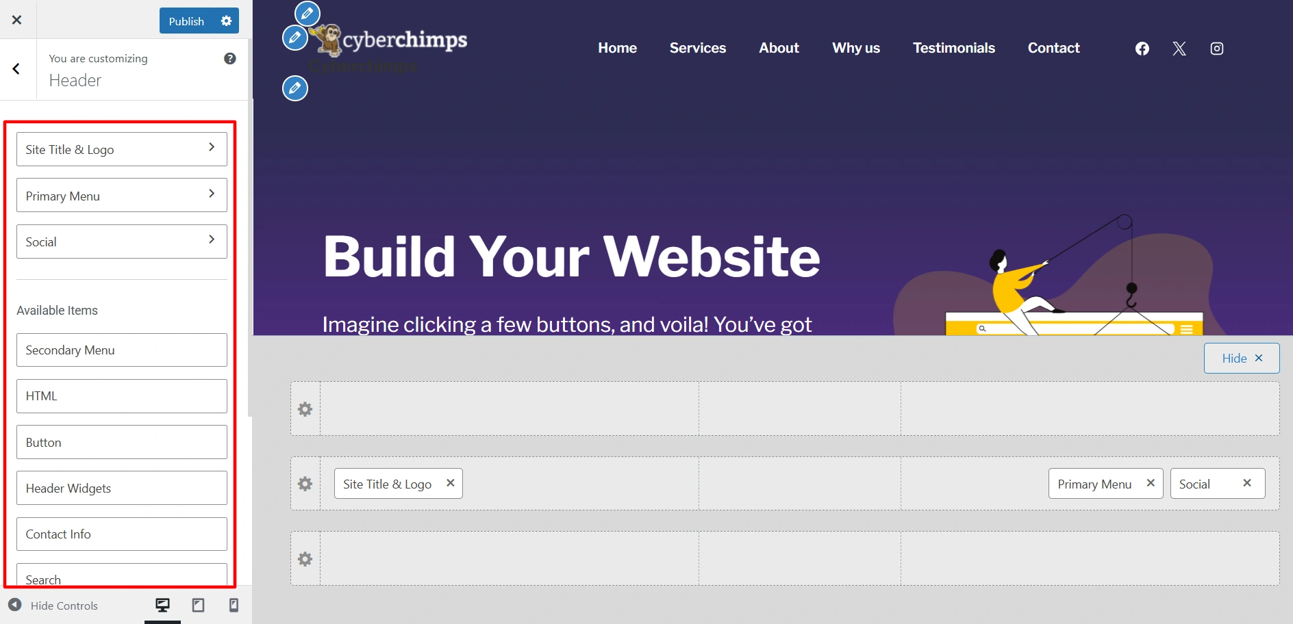
Step 1 – Select Header, and you’ll get to see a live preview area and a sidebar to drag and drop elements.
Step 2 – Select the mobile view in the customizer.
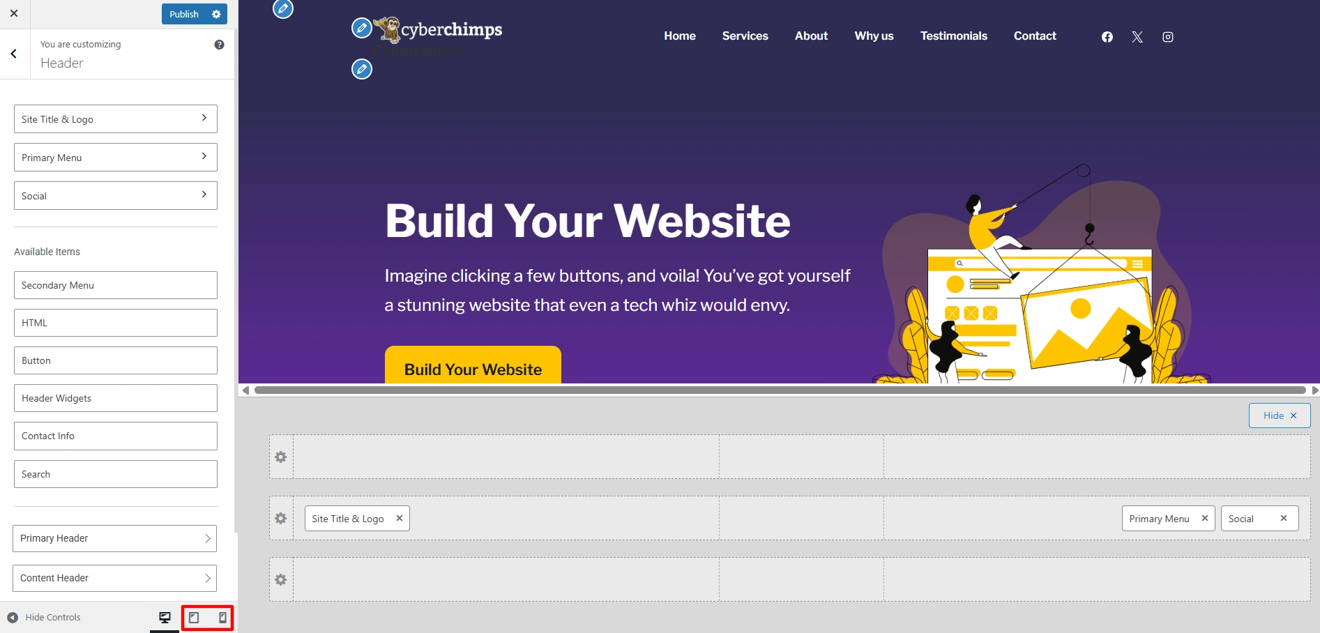
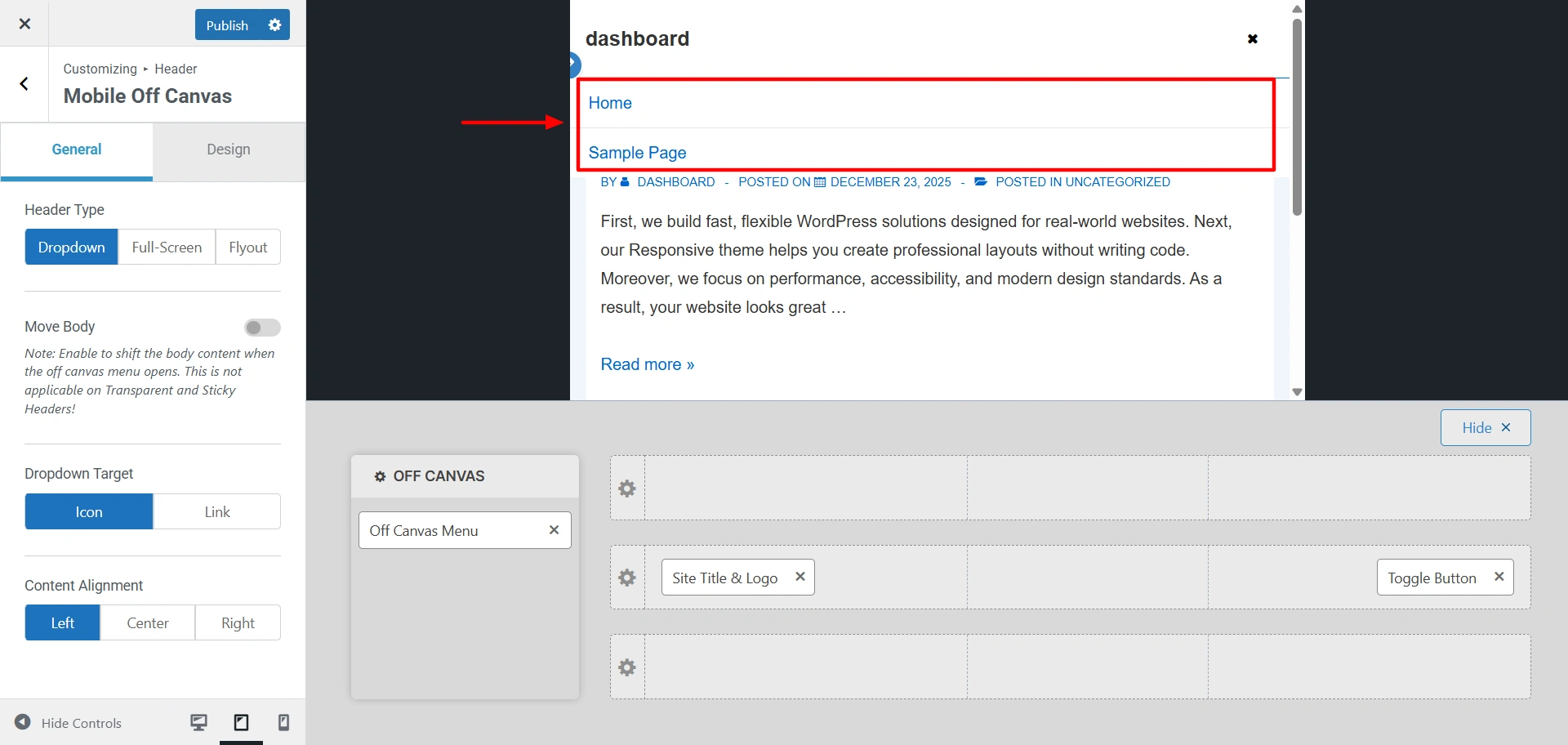
Off Canvas Menu is the panel that opens when a visitor clicks on the mobile menu icon.
Step 3 – Click the + icon to add header elements like Secondary Menu, Search, or Button.
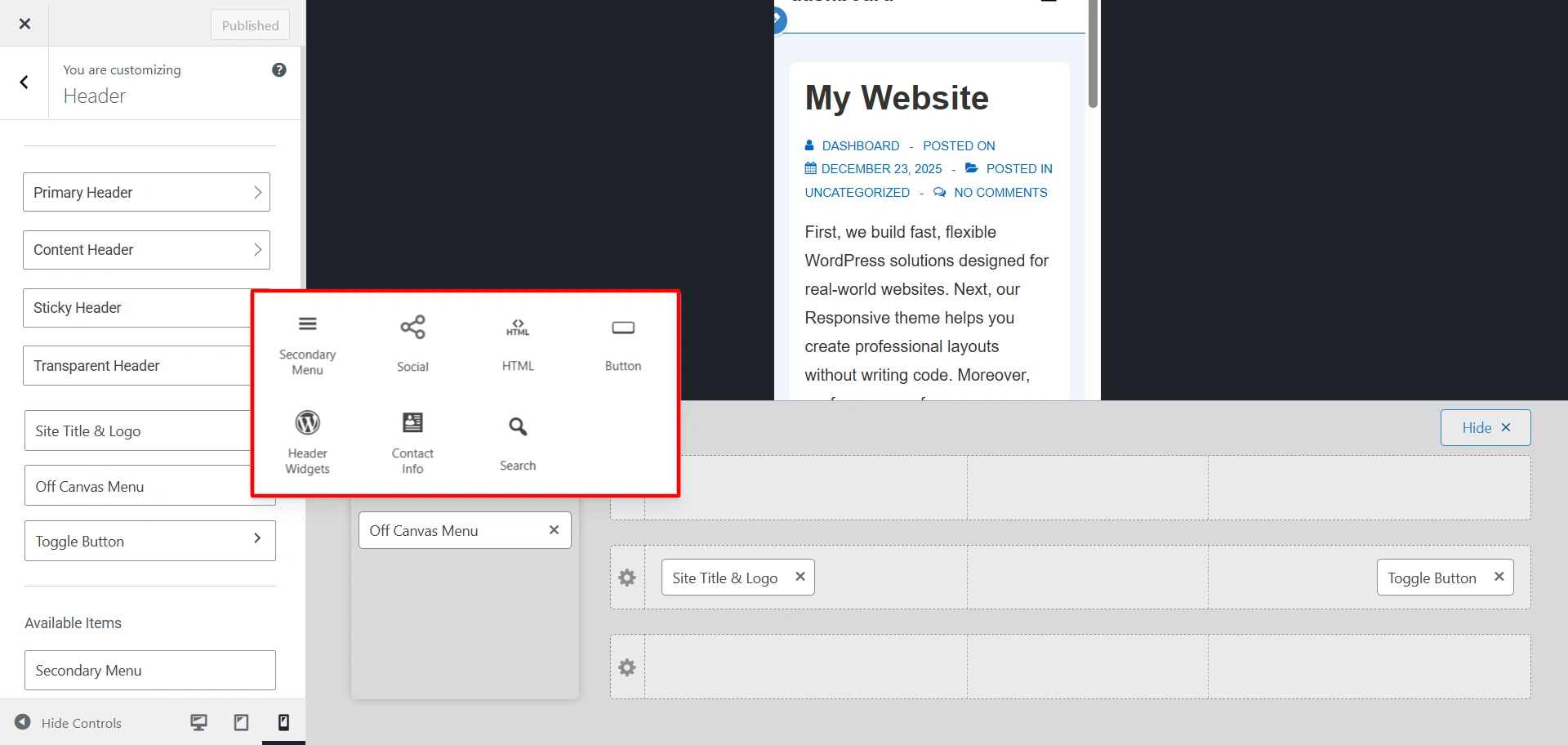
Step 4 – Click on the gear icon to select the mobile header type.
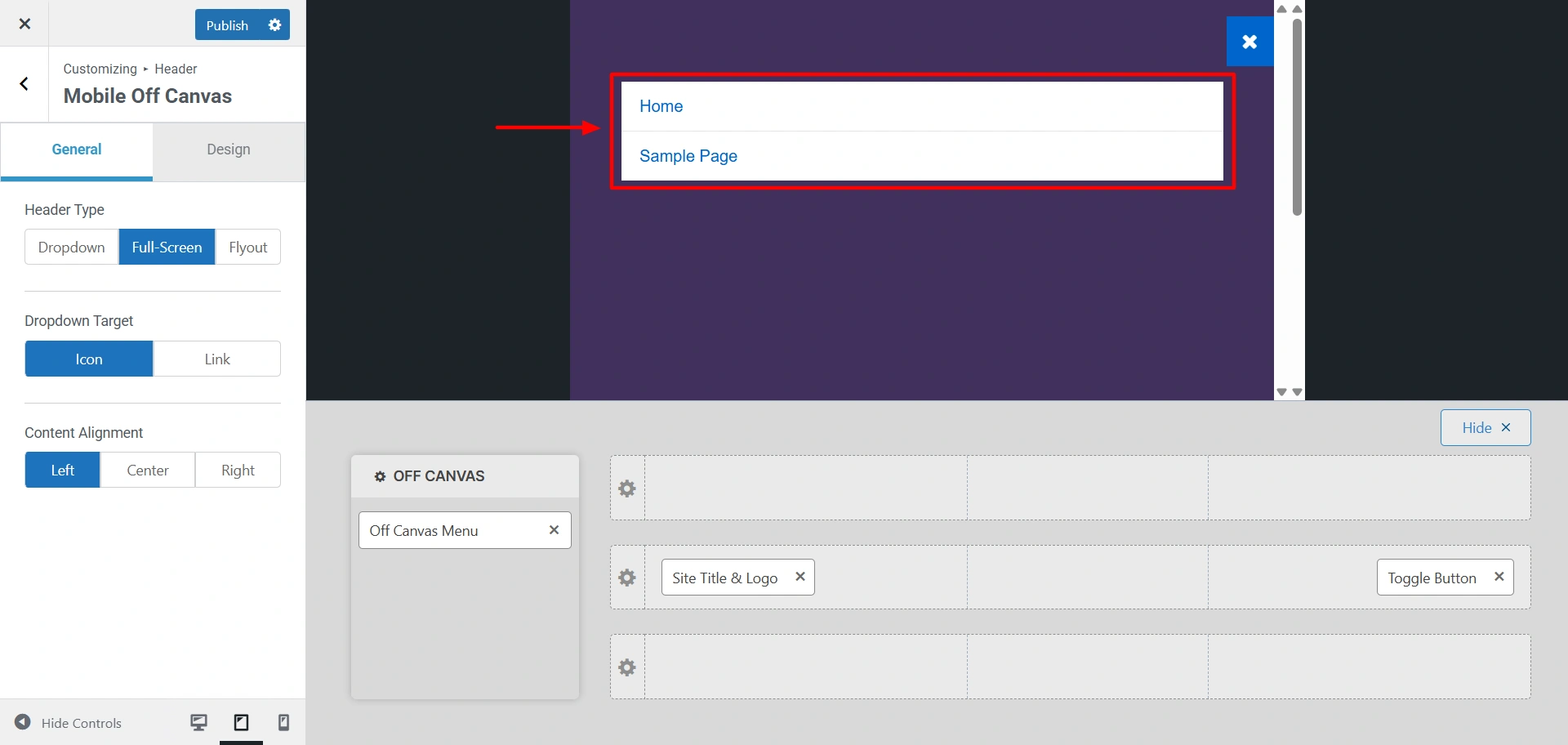
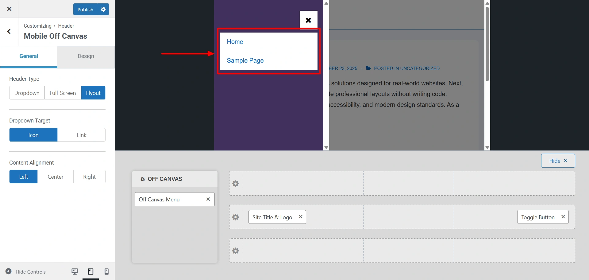
You can choose between these options:
- Dropdown: The menu will drop down from the top of the screen.
- Full-screen: The mobile menu will cover the entire screen once clicked.
- Flyout: The menu slides in from left to right on the screen, offering a smooth app like experience.
Under the Header Type, you also get the option of Dropdown Target and Content Alignment, where you can choose how you want to display your submenu.
You also get the option to change the mobile background colour under the Design tab.
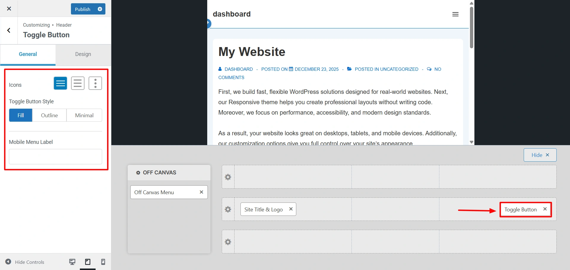
Step 5 – You can also edit the toggle button of your website, click on it and start customising.
After you are done with all your customization, hit Publish to finalise all the edits.


