From the WordPress dashboard navigate to Appearance > Customize to find the following options
Global Settings
Layout
Width – You can select the width of the website as full width or contained width here.
Container Width – You can set the width of the container from here.
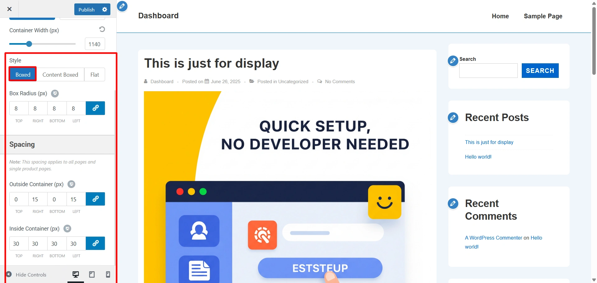
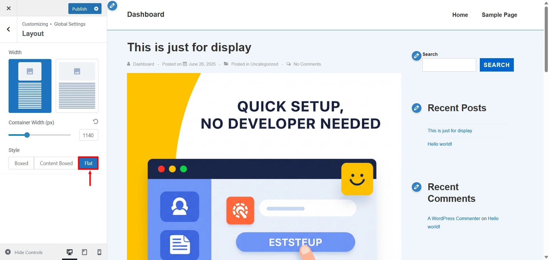
Style – Here you can select a layout for your website. There are 3 options to select from
Box Radius (px) – Radius for the selected layout style
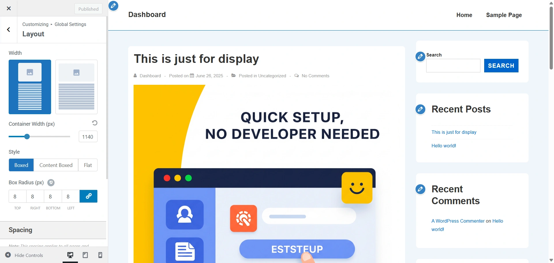
- Boxed – When Theme is newly installed or no layout is selected Default layout is selected. The container Width will be applied to this layout.
- Content Boxed – This layout is similar to the previous layout regarding container width. The content will have white background color. The container Width will be applied to this layout.
- Flat – This layout will remove the white background from the content. The content is displayed in a single container. The container Width will be applied to this layout.
Buttons
- Padding – Left, right, top and bottom can be given to buttons.
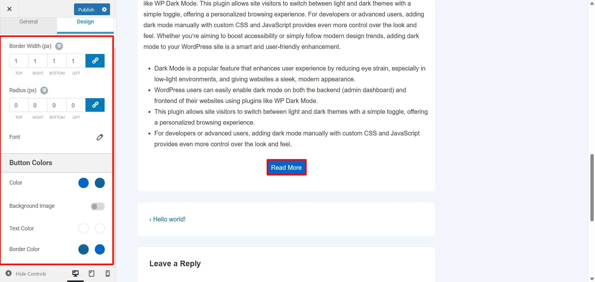
- Radius (px) – Border radius of all buttons. Here the border radius is in pixels.
- Border Width (px) – You can set the width of the button from here.
Buttons Typography – Here you can change the typography options for buttons. The following options are available:
- Font Family – Select font family from a large number of Google fonts.
- Font Size – Select font size.
- Font Weight – Select font weight.
- Text Transform – Select between Default, Capitalize, Lowercase or Uppercase.
- Font Style – Select font family style from normal and italic.
- Line Height – Give line-height from 1-4.
- Letter Spacing – Give letter spacing upto 10.
Button Colors – Here you can change the colors of your button. The following options are available:
- Color
- Background Image
- Text Color
- Border Color
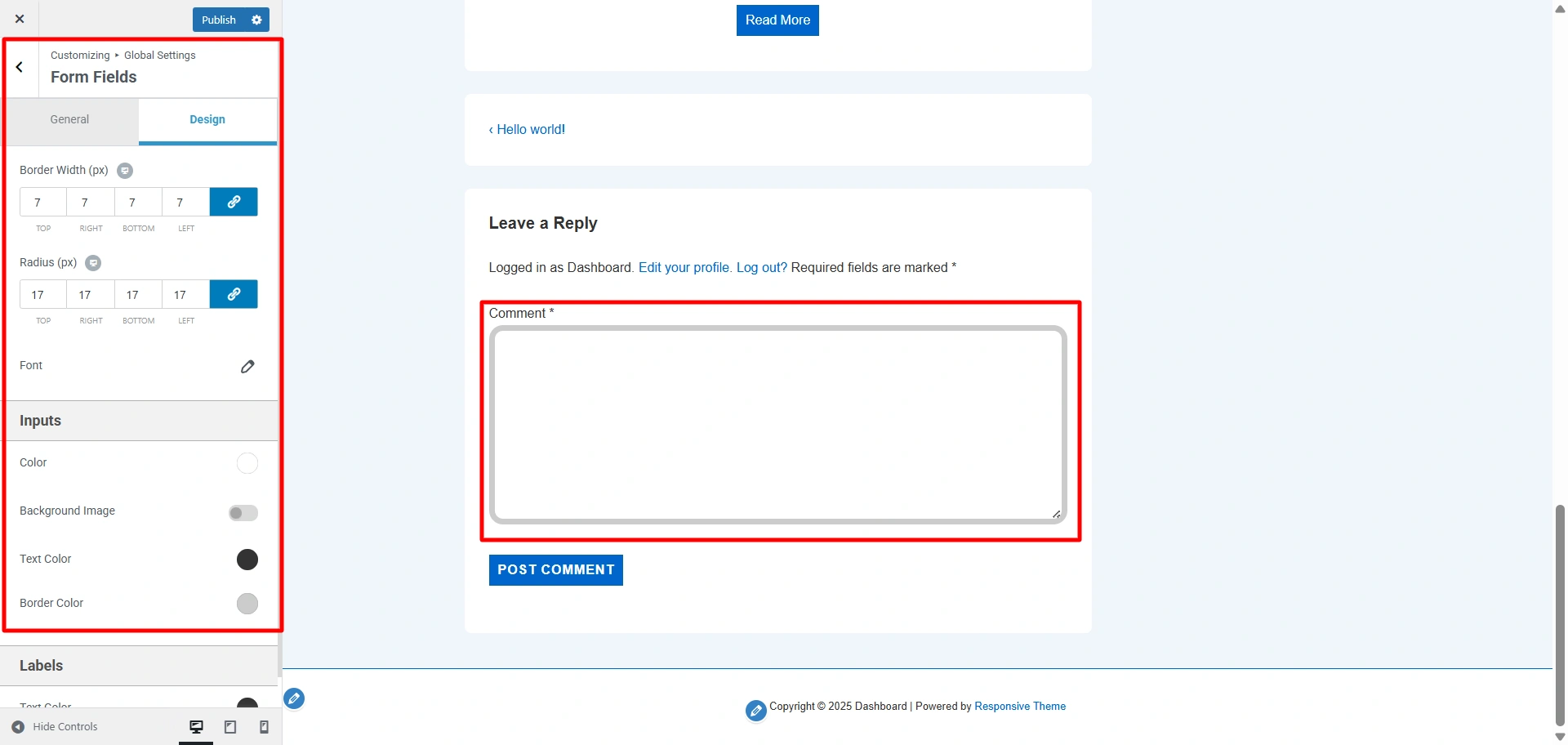
Form Fields
- Padding – Left, right, top and bottom padding can be given to
- Radius (px) – Border radius
- Border Width (px) – You can set the width of the form inputs from here.
Form Fields Typography – Here you can change the typography options for form fields. The following options are available:
- Font Family
- Font Weight
- Font Style
- Text Transform
- Line Height
- Letter Spacing
Inputs – Here you can update the following color of inputs present in the website.
- Background Color – If the button has any input field assigned then this color is used as background color for that input.
- Background Image – Background Image for input textbox.
- Text Color – If the button has any input field assigned then this color is used as text color for that input.
- Border Color – If the button has any input field assigned then this color is used as border color for that input.
Labels – Here you can change the color of any labels present on your website.
- Text Color – It allows you to change the text color for the label.
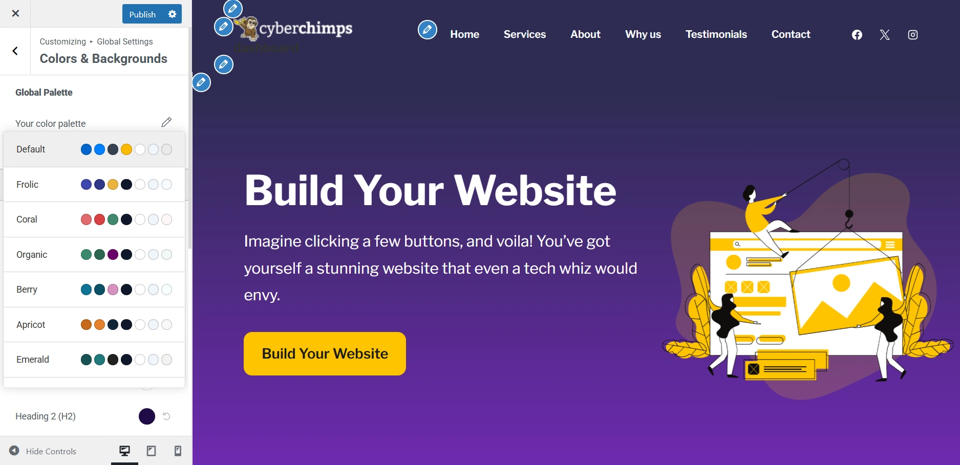
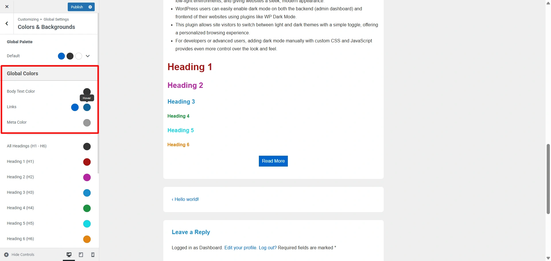
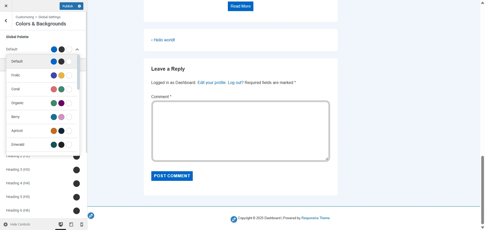
Colors & Backgrounds
Global Palette – With Global Palette you can select any predetermined color scheme from which colors will be applied to header, text, links, etc.
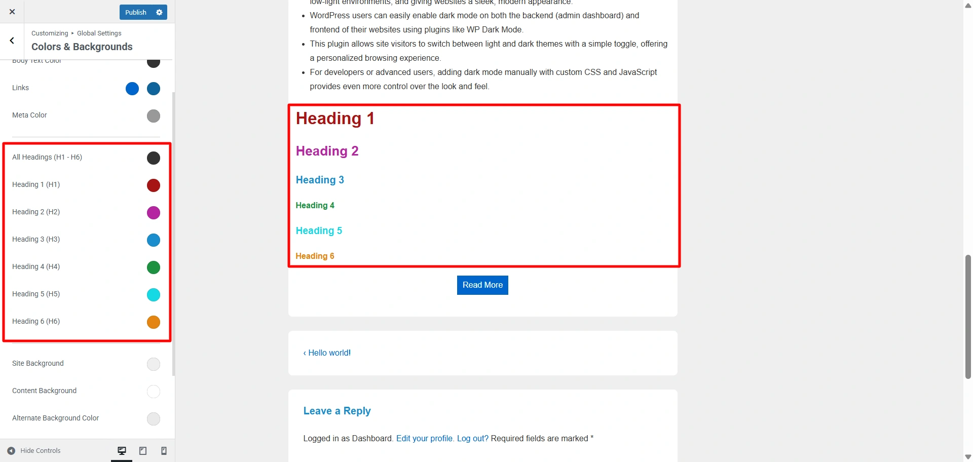
Global Colors
Here you can update the following colors present on your website:
- Body Text Color
- Heading ( H1 ) Color
- Heading ( H2 ) Color
- Heading ( H3 ) Color
- Heading ( H4 ) Color
- Heading ( H5 ) Color
- Heading ( H6 ) Color
- Meta Text Color
Links – Here you can update the following color of Links present in your website.
- Link Color
- Link Hover Color
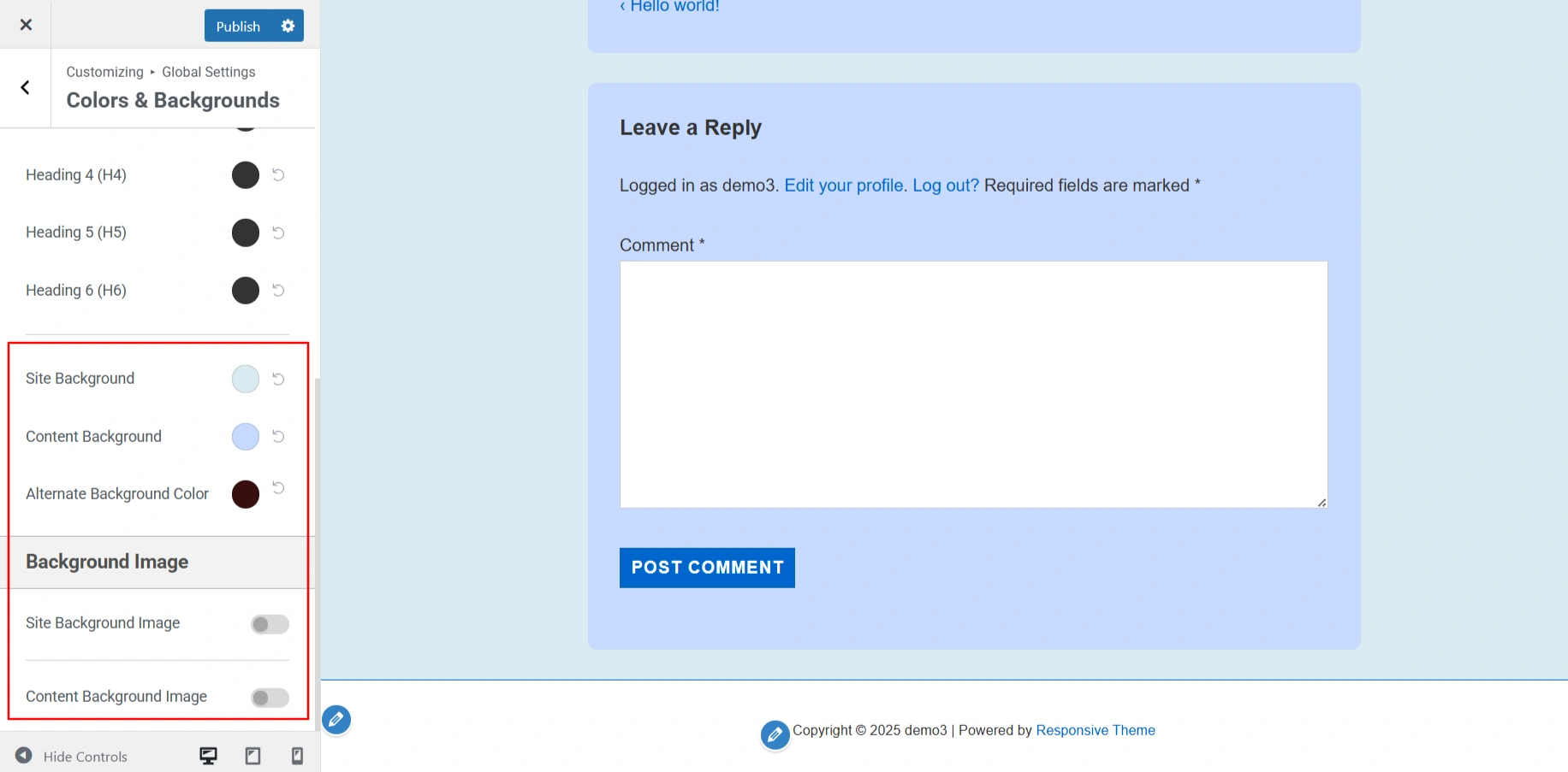
Site Background – Here you can select background color for your website.
Content Background – Here you can select background color for the main content area of your website.
Alternate Background Color – Here you can select background color for pre, blockquotes, code, etc.
Background Image – Here you can select a background image for your website. The following options are available:
- Site Background Image – You can add an image to your website
- Content Background Image – you can add an image to a main content area of your website.
Typography
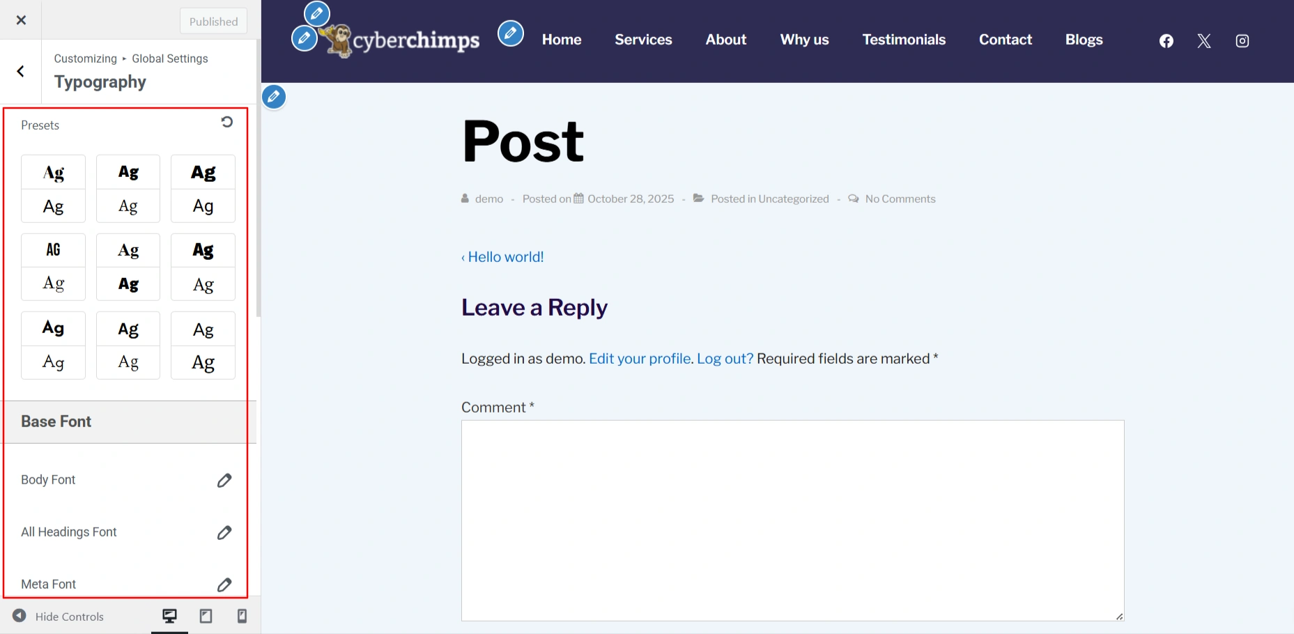
Presets – Here you can choose predefined typography combinations to quickly apply consistent font styles across your website.
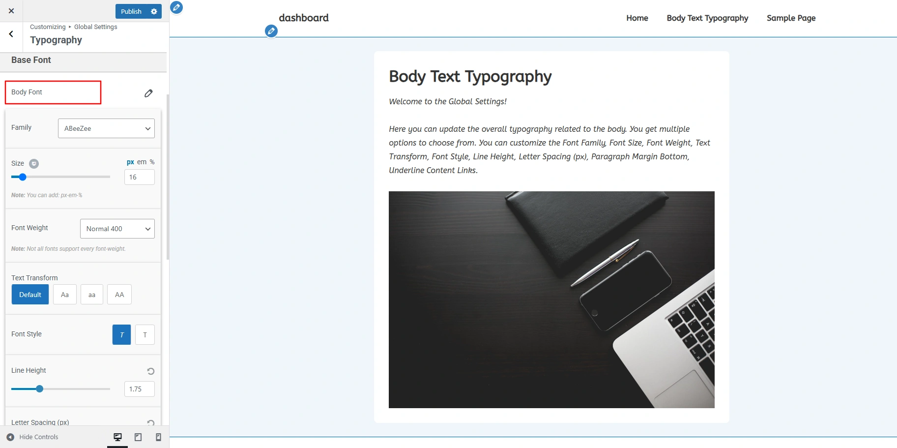
Body Font – Here you can update overall typography related to the body. You can update following options
- Font Family
- Font Size
- Font Weight
- Text Transform
- Font Style
- Line Height
- Letter Spacing (px)
- Paragraph Margin Bottom
- Underline Content Links
All Headings Font – Here you can change the overall typography of all the headings at once. The following options are available:
- Font Family
- Font Weight
- Text Transform
- Line Height
- Letter Spacing
Meta Font – Here you can change above specified typography options for Meta items.
Heading Font – Here you can update overall typography separately for all individual heading tags – H1, H2, H3, H4, H5 & H6
Embed Scripts
Embeds to header.php – Here you can add custom scripts, like meta tags or tracking codes, that load in the header section of your site.
Embeds to footer.php – Here you can add custom scripts, like analytics or chat widgets, that load just before the closing body tag (ideal for performance).
Header
In the Header section you can select options for your website’s header section.
Site Title & Logo
Here you can change the elements available all over your website. The following options are available:
- Logo – Here you can upload your website’s main logo to show in the header.
- Enable Retina Logo – You can upload a high-resolution version of your logo to make it clear on retina and high-DPI screens.
- Logo Width – With the help of this you can adjust the width of your logo to fit your header layout.
- Site Title – It lets you set and style the main title of your website showcased in the header.
- Tagline – Here you can add a short description or slogan that appears below or beside your site title.
- Different Logo for Mobile Devices – With this you can upload an alternate logo designed specifically for mobile devices for better visibility and design.
- Site Title/Logo URL
Here you can set a custom link for your site title or logo, usually pointing to your homepage.
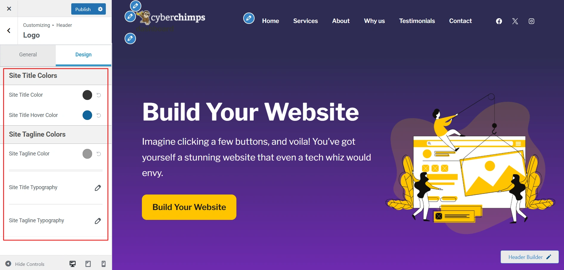
Site Title Colors – Here you can update all the colors for your website’s site title in the header. Here are all the options whose color can be updated.
- Site Title Color – Color for site title.
- Site Title Hover Color – Hover color for site title.
Site Tagline Colors – Here you can update all the colors for your website’s site tagline in the header. Here are all the options whose color can be updated.
Site Title Typography – Here you can update typography related to the Site Title. You can update the following options:
- Font Family
- Font Size
- Font Weight
- Text Transform
- Font Style
- Line Height
- Letter Spacing
Site Tagline Typography – Here you can update typography related to the Site Tagline. You can update all the following options as mentioned above.
Primary Menu
Primary Menu will allow you to edit the main menu settings for your website.
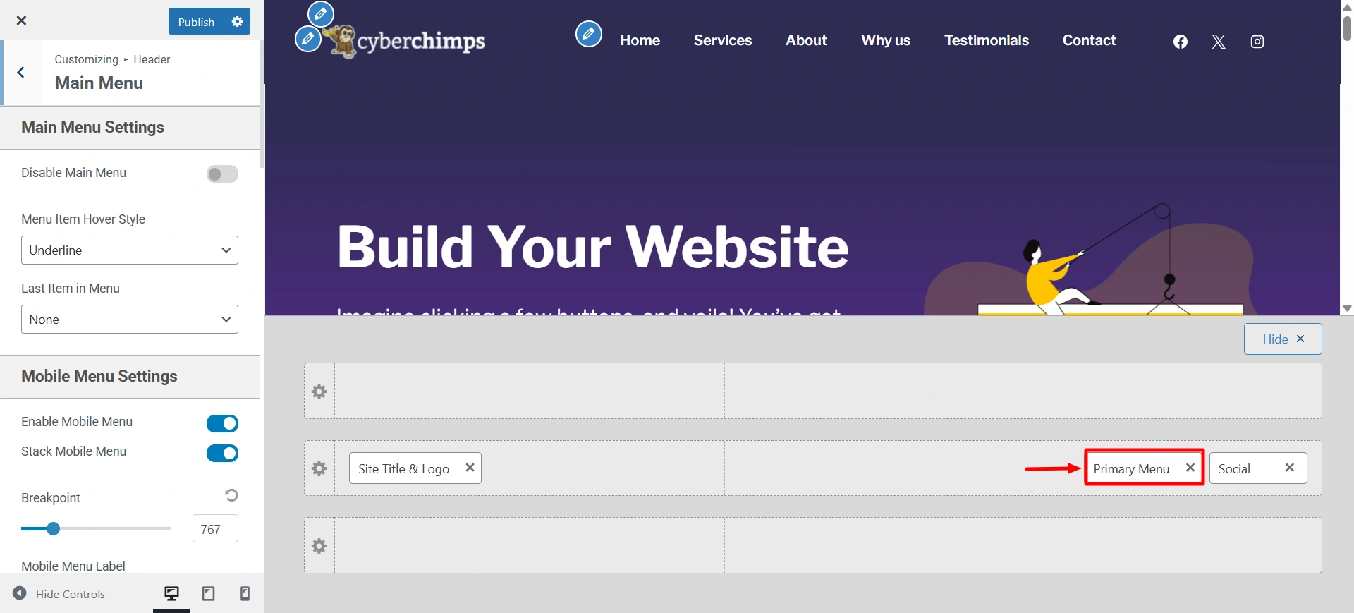
Main Menu Settings – Here you can update the following settings related to the main menu:
- Disable Main Menu – You can disable the menu from your website. Upon disabling the menu, all the settings related to the menu will not be visible.
- Menu Item Hover Style – Choose a hover effect from zoom in, underline and overline for all the primary menu items.
- Last Item in Menu – Select what you want to display as the last item in the primary menu. You can select the last item in the menu as Search icon, CTA Button, Text/HTML, or select none. This option will work only if you have a primary menu set.
- CTA Button Text – If you have selected the last item in the menu as a button then you can edit the text of the CTA button from here.
- CTA Button Link (URL) – If you have selected the last item in the menu as a button then you can edit the link of the CTA button from here.
- Custom Menu Text – If you have selected the last item in the menu as Text/HTML then you can edit the text from here.
To know more about Primary Menu you can refer to this article.
Secondary Menu – By using this you can add an additional navigation menu to the header of your website. To customize your secondary menu:
Go to Customize > Header > Secondary Menu
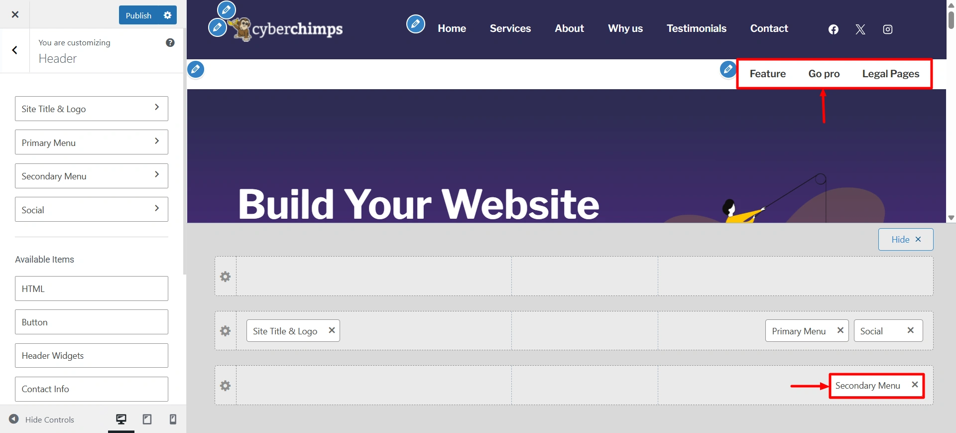
You can refer to this article to know about the available settings in the Secondary Menu.
Go through these documents to know about other features such as, Header Social, HTML, Header Button, Header Widgets, Contact Info, Search.
Breadcrumb
- Enable Breadcrumbs – If selected, page breadcrumbs and settings related to the breadcrumbs will not be visible.
- Breadcrumb Position – Display breadcrumb before or after heading from this option.
- Breadcrumb Separator – Separates your breadcrumb for easy understanding.
- Alignment – You can select alignment to display breadcrumb as Left, Right or Center.
- Spacing (px) – You can add spacing for your links on the website.
Display Settings – You will see a list of pages and posts where you can enable breadcrumbs. These include categories, archive pages, 404 pages, etc.
- Enable on Home page – Disables Breadcrumbs on Home Page.
- Enable on Blog /Posts page – Disables Breadcrumbs on Blog / Posts Page.
- Enable on Search – Disables Breadcrumbs on Search Page.
- Enable on Archive – Disables Breadcrumbs on Archive Page.
- Enable on Single Page – Disables Breadcrumbs on Single Page.
- Enable on Single Post – Disables Breadcrumbs on Single post Page.
- Enable on 404 page – Disables Breadcrumbs on 404 Page.
Breadcrumb Color – Here you can set breadcrumb color
Breadcrumb Font – Here you can update typography related to Header Content Title, Description, Breadcrumb separately. You can update following options
- Font Family
- Font Size
- Font Weight
- Text Transform
- Font Style
- Line Height
- Letter Spacing
Page
Main Content Width (%) – Here you can adjust the width of your main content on your pages.
Page Elements – Here you can set the order of Title, Featured Image and Content in which they appear. You need to drag the elements to change their order. Also you can toggle click on the eye icon in front of each element to show / hide that element on the page.
Sidebar – Here you can add widgets such as a search bar, recent posts, or custom menus. Typically positioned to the left or right side of the main content area.
Page Featured Image – Here you can adjust the feature image of any page of your website. The following options are available:
- Image Width Size (px) – Update the Featured image width size by slider. The default value will be used when the slider is in the middle. Dragging the slider to left or right will decrease or increase the image width respectively. You can click the reset button next to the input field to get the default value.
- Image Style – Here you can choose if you want to display the featured image of the page as default or stretched.
- Image Alignment – Here you can choose if you want to display the image at left, right, or center.
Page Title Alignment – Here you can choose if you want to display the title of the page at left, right, or center.
Page Content Alignment – You can choose if you want to display the blog page content at left, right, or center.
Title Font – You get the option to change the typography of the title on your website. The available options are:
- Font Family
- Font Size
- Font Weight
- Text Transform
- Font Style
- Line Height
- Letter Spacing
- Font Color
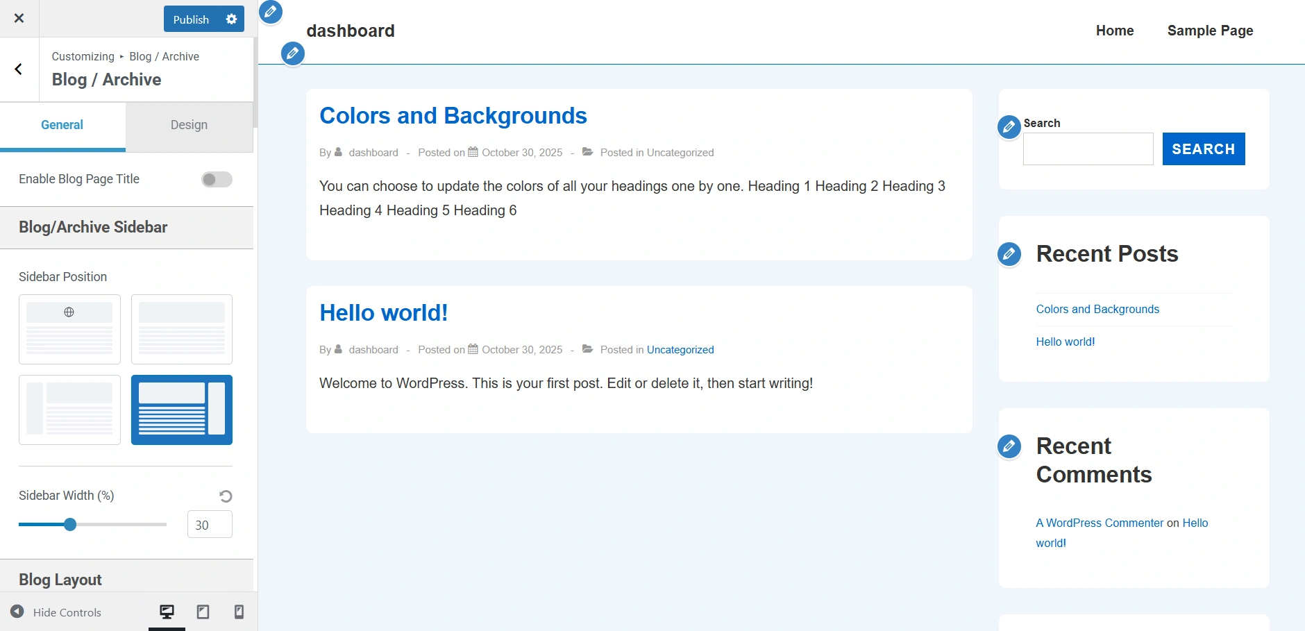
Blog / Archive
Blog / Archive
Enable Blog Page Title – If selected, you can give a title on the Blog page.
Blog / Archive Sidebar – You can select a layout for Blog page from following options
- Right Sidebar – Sidebar will appear on the right side. This is the most traditional way to show sidebar content.
- Left Sidebar – Sidebar will appear on the left side and the main content will be on the right side.
- No Sidebar – Sidebar will not be present and the content will span across the entire container width.
Blog / Archive Layout
Layout – Here you can choose the overall structure for your blog posts to display (grid or list style).
Blog Archive Columns – You can set how many columns of posts to show on the blog archive page. You can set up to 4 columns.
Enable Masonry Layout – For a more dynamic look you can toggle this on to arrange posts in a masonry-style grid.
Main Content Width (%) – Here you can adjust the width of the main blog content area.
Post Structure – Here you can set the order of Title, Meta, Featured Image and Content in which they appear. You need to drag the elements to change their order. Also, you can toggle click on the eye icon in front of each element to show/hide that element on the page.
Post Meta
- Meta Elements – If you have kept Meta elements visible in above Post Structure options then you can decide the order and visibility of individual Post Meta including Author, Date Published, Categories, Tags, Last Updated, Comments.
- Meta Separator – Here you can edit the separator that will be present in between different meta elements.
- Meta Alignment – Here you can choose if you want to display the meta of the blog page at left, right, or center.
Featured Image
- Image Width Size (px) – Update the Featured image width size by slider. The default value will be used when the slider is in the middle. Dragging the slider to left or right will decrease or increase the image width respectively. You can click the reset button next to the input field to get the default value.
- Image Style – Here you can choose if you want to display the featured image of the blog as default or stretched.
- Image Alignment – Here you can choose if you want to display the image at left, right, or center.
- Post Title Alignment – Here you can choose if you want to display the title of the blog page at left, right, or center.
Content
- Content Type – Choose if you want to display post content as Excerpt or full Content.
- Content Alignment – Here you can choose if you want to display the blog page content at left, right, or center.
- Excerpt Length – If you have chosen excerpt as post content, choose the total length of the excerpt to display.
- Read More Text – If you have chosen excerpt as post content, you can edit the read more text here.
- Read More Type – If you have chosen excerpt as post content, you can choose the display of read more text as a link or button.
Exclude Categories from Blog page – Selected the categories which you wish not to be displayed on the blog page.
Post Pagination – Here you can choose how the posts will load on the blog page either in default numbered pages or infinite scroll.
Spacing – It lets you set the spacing around and within the blog content container. You get two options to do so:
- Outside Container (px)
- Inside Container (px)
Single Post
Main Content Width – You can select the width of the content here for a single blog post.
Post Elements – Here you can set the order of Title, Meta, Featured Image and Content in which they appear. You need to drag the elements to change their order. Also you can toggle click on the eye icon in front of each element to show / hide that element on the page.
Sidebar – You can select a layout for single post pages from following options
- Right Sidebar – Sidebar will appear on the right side. This is the most traditional way to show sidebar content.
- Left Sidebar – Sidebar will appear on the left side and the main content will be on the right side.
- No Sidebar – Sidebar will not be present and the content will span across the entire container width.
Featured Image
- Image Width Size (px) – Update the Featured image width size by slider. Default value will be used when the slider is in the middle. Dragging the slider to left or right will decrease or increase the image width respectively. You can click the reset button next to the input field to get the default value.
- Image Style – Here you can choose if you want to display the featured image of the blog as default or stretched.
- Image Alignment – Here you can choose if you want to display the image at left, right or center.
Title Alignment – You can choose if you want to display the page title at left, right or center.
Meta
Disable Author Profile Box – Enable or disable the author’s biographical info after posts. Author biographical info can be added/updated from the user update page.
Meta Elements – If you have kept Meta elements visible in the above Post Elements options then you can decide the order and visibility of individual Post Meta including Author, Date Published, Categories, Comments, Tags, Last Updated.
Meta Separator – Here you can edit the separator that will be present in between different meta elements
Meta Alignment – Here you can choose if you want to display the meta of the blog page at left, right, or center.
Post Content Alignment – Here you can choose if you want to display the blog page content at left, right or center.
Related Posts
Enable Related Posts – Toggle it on to display related posts at the end of each blog post.
Spacing – It lets you set the spacing around and within the related posts section. You get two options to do so:
- Outside Container (px)
- Inside Container (px)
This option allows you to add sidebar across your entire website.
Sidebar
To know more about sidebar customization you can read How To Add Sidebar in Responsive Theme.
Footer which is at the bottom of your website provides you the space to add and customize some widgets the way you want.
Footer
You can also read Footer Builder to know in detail more about footers in the Responsive Theme.
Site Identity
Site Icon – It lets you select the icon for your website.
With this feature, fonts are stored on your server, so the fonts don’t get repopulated from Google with every page view.
Site Title and Logo Settings – Upon clicking this you will be redirected to the Logo customization as discussed under the Header feature.
Performance
This leads to a better overall speed experience and improves the Core Web Vitals metrics when using Local Fonts.
To read more about How To Load Google Fonts Locally you can read this article.
Site identity
Enable Retina Logo – Check if you are uploading the Retina Logo for the website.
Different Logo for Mobile Devices – Check if you are want to display a different logo for Mobile Devices.
Global Settings
Layout
Contained Layout with Boxed Style
Width – You can select the width of the website as full width or contained width here.
Container Width – You can set the width of container from here.
Style – Here you can select a layout for your website. There are 3 options to select from
- Boxed – When Theme is newly installed or no layout is selected Default layout is selected. The container Width will be applied to this layout.
- Content Boxed – This layout is similar to previous layout regarding container width. Content will have white background color. The container Width will be applied to this layout.
- Flat – This layout will remove the white background from the content. The content is displayed in a single container. The container Width will be applied to this layout.
Flat Layout
Box Radius (px) – Radius for the selected layout style
Buttons
- Padding – Left, right, top and bottom can be given to button.
- Radius (px) – Border radius of all buttons. Here border radius is in pixels.
- Border Width (px) – You can set the width of the button from here.
Buttons Typography Here you can change the typography options for button. The following options are available:
- Font Family
- Font Weight
- Font Style
- Text Transform
- Line Height
- Letter Spacing
Form Fields
- Padding – Left, right, top and bottom padding can be given to
- Radius (px) – Border radius
- Border Width (px) – You can set the width of the form inputs from here.
Form Fields Typography Here you can change the typography options for form fields. The following options are available:
- Font Family
- Font Weight
- Font Style
- Text Transform
- Line Height
- Letter Spacing
Color Palettes Scheme
With Color palettes Scheme you can select any predetermined color scheme from which colors will be applied to header, text, links, etc.
Colors & Backgrounds
Site Background
Here you can select background colour for your website
Content Background
Here you can select background colour for the main content area of your website.
Alternate Background Colour
Here you can select background color for pre, blockquotes, code etc.
Background Image
Here you can select a background image for your website.
When you toggle on the Site Background Image you can add image to your website.
With the Content Background Image, you get the option to add image to a main content area of your website.
General Text
Here you can update following color present in website.
- Body Text Color
- Heading ( H1 ) Color
- Heading ( H2 ) Color
- Heading ( H3 ) Color
- Heading ( H4 ) Color
- Heading ( H5 ) Color
- Heading ( H6 ) Color
- Meta Text Color
Links
Here you can update following color of Links present in website.
- Link Color
- Link Hover Color
Typography
Presets
Here you can choose predefined typography combinations to quickly apply consistent font styles across your website.
Here you can update overall typography related to body. You can update following options
- Font Family – Select font family from large number of Google fonts.
- Font Weight
- Font Style
- Text Transform – Select between Default, Capitalize, Lowercase or Uppercase.
- Font Size
- Line Height
- Letter Spacing
- Paragraph Margin Bottom
All Headings
Here you can update overall typography separately for all individual heading tags – H1, H2, H3, H4, H5 & H6
- Font Family
- Font Weight
- Text Transform
- Line Height
- Letter Spacing
Meta
Here you can change above specified typography options for Meta items.
Buttons
Here you can update colors & border radius for all the buttons on your website. Following is a list of all the options.
- Button Color – Main button color.
- Background Image (Pro) – Background Image for button.
- Button hover Color – Button color will be visible on mouse hover.
- Button Text Color – Color of the text on button.
- Hover Text Color – Color for the button text on mouse hover.
- Border Color – Border color for buttons.
- Hover Border Color – Border color for buttons on mouse hover.

Inputs
Here you can update following color of inputs present in website.
- Input Background Color – If button has any input field assigned then this color is used as background color for that input.
- Background Image (Pro) – Background Image for input textbox
- Input Text Color – If button has any input field assigned then this color is used as text color for that input.
- Input Border Color – If button has any input field assigned then this color is used as border color for that input.
Labels
- Label Color – Text color for the label if any label is present.
Typography
Presets
Here you can choose predefined typography combinations to quickly apply consistent font styles across your website.
Here you can update overall typography related to body. You can update following options
- Font Family – Select font family from large number of Google fonts.
- Font Weight
- Font Style
- Text Transform – Select between Default, Capitalize, Lowercase or Uppercase.
- Font Size
- Line Height
- Letter Spacing
- Paragraph Margin Bottom

All Headings
Here you can update overall typography separately for all individual heading tags – H1, H2, H3, H4, H5 & H6
- Font Family
- Font Weight
- Text Transform
- Line Height
- Letter Spacing
Meta
Here you can change above specified typography options for Meta items.
Header
In Header section you can select options for your website’s header section
Primary Header
Full Width header – Upon selecting this checkbox header will become full width other wise header width will be same as container width.
Inline Logo and Site Title – Upon selecting this checkbox, the logo and site title will be displayed next to each other instead of site title below logo.
Enable Header Bottom Border – Upon selecting this checkbox, primary header bottom border will be displayed.

Header Elements – Position of Site Branding & Navigation can be changed by using this option. Also any of those elements can be disabled by clicking on eye icon in front of the element name.
Header Layout – Here you can select the layout as Horizontal or vertical to display logo and menu accordingly.

Header Height – Here you can increase or decrease the height of the primary header.

Header Alignment – If the header layout is vertical, you can select the alignment for site branding and main navigation as left, right, or center.
Mobile Header Layout – Here you can select the layout as Horizontal or vertical to display logo and menu accordingly in mobile devices.
Logo Padding (px) – Here you can give top, bottom, left and right padding to logo.
Bottom Border Size – Here you can increase or decrease the bottom width of header.

Header Colors
Here you can update all the colors for your website header. Here are all the options whose color can be updated
- Background Color – Background color for Header
- Background Image (Pro) – Background Image for Header
- Border Color – Color for header border
Site Title

Site Title Colors
Here you can update all the colors for your website’s site title in the header. Here are all the options whose color can be updated.
- Site Title Color – Color for site title.
- Site Title Hover Color – Hover color for site title.
Site Title Typography
Here you can update typography related to the Site Title. You can update the following options
- Font Family – Select font family from large number of Google fonts.
- Font Weight – Select font weight.
- Font Style – Select font family style from normal and italic.
- Text Transform – Select between Default, Capitalize, Lowercase or Uppercase.
- Font Size – Select font size.
- Line Height – Give line-height from 1-4.
- Letter Spacing – Give letter spacing upto 10.
Site Tagline

Site Tagline Colors
Here you can update all the colors for your website’s site tagline in the header. Here are all the options whose color can be updated.
- Site Tagline Color – Color for site tagline
Site Tagline Typography
Here you can update typography related to the Site Tagline. You can update the following options
- Font Family – Select font family from large number of Google fonts.
- Font Weight – Select font weight.
- Font Style – Select font family style from normal and italic.
- Text Transform – Select between Default, Capitalize, Lowercase or Uppercase.
- Font Size – Select font size.
- Line Height – Give line-height from 1-4.
- Letter Spacing – Give letter spacing upto 10.
Header Widgets
Enable Header Widgets – Here you can enable or disable header widgets.
Add Header Widgets – Upon clicking this button, you will be redirected to the Header Widgets section under Widgets panel where you can add, edit or remove widgets.

Widgets Position – Here you can select where you want to display the widgets, above header, beside logo or below header.
Widgets Alignment – Here you can select the alignment of the widgets as left, right, center, spread or space around.

Header Widget Colors
- Text Color – Text color for header widget.
- Background Color – Background color for header widget.
- Background Image (Pro) – Background Image for widget
- Border Color – Border color for header widget.
- Links Color – Text color for link.
- Links Hover Color – Hover color for links
Header Widgets Typography
Here you can update overall typography related to Header Widgets. You can update following options
- Font Family – Select font family from large number of Google fonts.
- Font Weight – Select font weight.
- Font Style – Select font family style from normal and italic.
- Text Transform – Select between Default, Capitalize, Lowercase or Uppercase.
- Font Size – Select font size.
- Line Height – Give line-height from 1-4.
- Letter Spacing – Give letter spacing upto 10.
Content Header
- Disable Breadcrumb List – If selected, page breadcrumbs and settings related to the breadcrumbs will not be visible.
- Breadcrumb Position – Display breadcrumb before or after heading from this option.
Disable Breadcrumb on specific pages/post: You will see a list of pages and posts where you can disable breadcrumbs. These include categories, archive pages, 404 pages, etc.
- Disable on Home page? – Disables Breadcrumbs on Home Page.
- Disable on Blog /Posts page? – Disables Breadcrumbs on Blog / Posts Page.
- Disable on Search? – Disables Breadcrumbs on Search Page.
- Disable on Archive page? – Disables Breadcrumbs on Archive Page.
- Disable on Single page? – Disables Breadcrumbs on Single Page.
- Disable on Single post? – Disables Breadcrumbs on Single post Page.
- Disable on Singular? – Disables Breadcrumbs on Singular Page.
- Disable on 404 page? – Disables Breadcrumbs on 404 Page.
- Alignment – You can select alignment to display breadcrumb as Left, Right or Center.
- Spacing (px) – Spacing for the content header on website.

Content Header Colors
Here you can set Title Color, Description Color, and Breadcrumb Color.
Content Header Typography
Here you can update overall typography related to Header Content Title, Description, Breadcrumb separately. You can update following options
- Font Family – Select font family from large number of Google fonts.
- Font Weight – Select font weight.
- Font Style – Select font family style from normal and italic.
- Text Transform – Select between Default, Capitalize, Lowercase or Uppercase.
- Font Size – Select font size.
- Line Height – Give line-height from 1-4.
- Letter Spacing – Give letter spacing upto 10.
Main Menu

Main Menu Settings
Here you can update the following settings related to the main menu
- Disable Menu – You can disable the menu from your website. Upon disabling the menu, all the settings related to the menu will not visible.
- Full Width Main Navigation – Enable / Disable full-width menu.
- Menu Item Hover Style – Choose a hover effect from zoom in, underline and overline for all the primary menu items.
- Last Item in Menu – Select what you want to display as the last item in primary menu. You can select last item in menu as Search icon, CTA Button, Text/HTML, or select none. This option will work only if you have primary menu set.
- CTA Button Text – If you have selected the last item in menu as button then you can edit the text of the CTA button from here.
- CTA Button Link (URL) – If you have selected the last item in menu as button then you can edit the link of the CTA button from here.
- Custom Menu Text – If you have selected the last item in menu as Text/HTML then you can edit the text from here.
- Spread Menu and Last Item – Enable this checkbox to spread the menu and last item in menu to the left and right side respectively. This will be applicable when Last Item in Menu option is used.

Mobile Menu Settings
- Enable Mobile Menu – Enable / Disable mobile menu.
- Stack Mobile Menu – Enable this checkbox to have stacked view or uncheck checkbox for unstacked view Mobile Menu.
- Hide Last item in Mobile Menu – You can hide the last item in Mobile Menu.
- Menu Breakpoint in pixels which will be used to decide which menu (Desktop or Mobile) should be displayed. This option will appear only if you’ve enabled mobile menu.
- Mobile Menu Label – Text as a label for mobile menu.
- Menu Label Font Size – Update Font size for mobile menu label.
- Mobile Menu Style – Choose a menu opening style (Dropdown / FullScreen / Sidebar) for mobile view.
- Mobile Menu Toggle Style – Select from Fill, Outline or Minimal options as mobile menu toggle style.
- Mobile Menu Button Radius (px) – For Fill & Outline mobile menu you can update mobile menu button radius.

Main Menu Typography
Here you can update overall typography related to the main menu. You can update the following options
- Font Family – Select font family from large number of Google fonts.
- Font Weight – Select font weight.
- Font Style – Select font family style from normal and italic.
- Text Transform – Select between Default, Capitalize, Lowercase or Uppercase.
- Font Size – Select font size.
- Line Height – Give line-height from 1-4.
- Letter Spacing – Give letter spacing upto 10.

Main & Mobile Menu Colors
Here you can update all the colors for the main menu and the mobile menu. Here are all the options whose color can be updated
- Background Color – Background color for the main navigation. (Upon selecting primary header layout as Vertical, this setting will be available)
- Border Color – Divider color between site branding and main navigation. (Upon selecting primary header layout as Vertical, this setting will be available)
- Mobile Menu Background Color – Background color for the mobile menu.
- Active Menu Background Color – Background color for the active main menu item.
- Hover Menu Background Color – Background hover color for the main menu item.
- Menu Item Link Color – Text color for menu link text.
- Active Menu Item Link Color – Text color for active menu link text.
- Menu Item Link Hover Color – Hover color for link text.
- Menu Toggle Background Color – Background color for mobile toggle button.
- Menu Toggle Color – Toggle color for menu.

Sub Menu Settings
Here you can update the following settings related to the sub menu
- Container Border – Update size of the container border for sub menu.
- Container Top Offset – Adjust the slider to change the height between the menu’s item and its child element.
- Item Divider – Enable / Disable item divider in sub menu.

Sub Menu Colors
Here you can update all the colors for the sub menu. Here are all the options whose color can be updated
- Container Border Color – Border color of the sub menu container.
- Divider Color – Color for the divider in the sub menu.
- Sub Menu Background Color – Background color for sub menus.
- Active Sub Menu Background Color – Background color for the active item in the sub menu.
- Hover Sub Menu Background Color – Background hover color for the sub menu item.
- Sub Menu Item Link Color – Link color for sub menus items.
- Active Sub Menu Item Link Color – Link color for active sub-menu item.
- Sub Menu Item Link Hover Color – Link hover color for sub menus items.
Transparent Header

Enable on Complete Website – Select this option to enable the transparent header on the complete website.
Different Logo for Transparent Header – Check this checkbox to display the different logo for pages with the transparent header.
Enable Transparent Header Bottom Border – Upon selecting this checkbox, transparent header bottom border will be displayed.

Transparent Header Height – Here you can increase or decrease the transparent header height.

Site Content Padding (px) – Padding for the website content when a transparent header is enabled.
Bottom Border Size – Here you can increase or decrease the bottom width of header when a transparent header is enabled.

Disable the transparent header on certain pages – Select the appropriate checkboxes to disable the transparent header on those pages.
Transparent Header Colors – Here you can update all the colors for your website header if you have enabled Transparent Colors. Here are all the options whose color can be updated:
- Background Color – Background color for Header
- Background Image (Pro) – Background Image for Header
- Border Color – Color for header border
- Site Title Color – Color for site title
- Site Title Hover Color – Hover color for site title
- Site Tagline Color – Color for site tagline
Transparent header Menu – Select the colors for menu elements when the transparent header is enabled.
Header Widget – Select colors for header widgets when transparent header is enabled.
Scripts
Embed a script into website’s header from here.
Page
Content
- Main Content Width – You can select the width of the content here for pages here.
- Page Elements – Here you can set the order of Title, Featured Image and Content in which they appear. You need to drag the elements to change their order. Also you can toggle click on the eye icon in front of each element to show / hide that element on page.

- Page Featured Image
- Image Width Size (px) – Update the Featured image width size by slider. The default value will be used when the slider is in the middle. Dragging the slider to left or right will decrease or increase the image width respectively. You can click the reset button next to the input field to get the default value.
- Style – Here you can choose if you want to display the featured image of the page as default or stretched.
- Alignment – Here you can choose if you want to display the image at left, right, or center.
- Page Title
- Alignment – Here you can choose if you want to display the title of the page at left, right, or center.
- Page Content
- Content Alignment – Here you can choose if you want to display the blog page content at left, right, or center.
Blog / Archive
Blog / Archive
- Enable Blog Page Title – If selected, you can give a title on the Blog page.
- Blog Page Title – Here, you can edit the title of the Blog page.
- Main Content Width – You can select the width of the content here for the blog page.
- Entry Columns – You can select the number of columns to display blogs. Blog entries will be displayed in the number of columns you select.
- Exclude Categories from Blog page – Selected the categories which you wish not to be displayed on the blog page.

Entry Elements – Here you can set the order of Title, Meta, Featured Image and Content in which they appear. You need to drag the elements to change their order. Also, you can toggle click on the eye icon in front of each element to show/hide that element on the page.
Entry Featured Image
- Image Width Size (px) – Update the Featured image width size by slider. The default value will be used when slider is in the middle. Dragging the slider to left or right will decrease or increase the image width respectively. You can click the reset button next to the input field to get the default value.
- Style – Here you can choose if you want to display the featured image of the blog as default or stretched.
- Alignment – Here you can choose if you want to display the image at left, right, or center.
Entry Title
- Alignment – Here you can choose if you want to display the title of the blog page at left, right, or center.
Entry Meta
- Meta Elements – If you have kept Meta elements visible in above Post Elements options then you can decide the order and visibility of individual Post Meta including Author, Date, Categories, Comments, Tags.
- Meta Separator – Here you can edit the separator that will be present in between different meta elements.
- Meta Alignment – Here you can choose if you want to display the meta of the blog page at left, right, or center.
Entry Content
- Content Type – Choose if you want to display post content as Excerpt or full Content.
- Content Alignment – Here you can choose if you want to display the blog page content at left, right, or center.
- Excerpt Length – If you have chosen excerpt as post content, choose the total length of the excerpt to display.
- Read More Text – If you have chose excerpt as post content, you can edit the read more text here.
- Read More Type – If you have chosen excerpt as post content, you can choose the display of read more text as a link or button.
Single Post
- Main Content Width – You can select the width of the content here for single blog post.
- Post Elements – Here you can set the order of Title, Meta, Featured Image and Content in which they appear. You need to drag the elements to change their order. Also you can toggle click on the eye icon in front of each element to show / hide that element on page.
- Post Featured Image
- Image Width Size (px) – Update the Featured image width size by slider. Default value will be used when slider is in the middle. Dragging slider to left or right will decrease or increase the image width respectively. You can click the reset button next to input field to get the default value.
- Style – Here you can choose if you want to display the featured image of the blog as default or stretched.
- Alignment – Here you can choose if you want to display the image at left, right or center.
- Post Title
- Alignment – Here you can choose if you want to display the page title at left, right or center.

- Post Meta
- Meta Elements – If you have kept Meta elements visible in the above Post Elements options then you can decide order and visibility of individual Post Meta including Author, Date, Categories, Comments, Tags.Meta Separator – Here you can edit the separator that will be present in between different meta elementsMeta Alignment – Here you can choose if you want to display the meta of the blog page at left, right, or center.Disable Author Profile Box (Responsive Plus) – Enable or disable the authors biographical info after posts. Author biographical info can be added/updated from user update page.
- Post Content
- Content Alignment – Here you can choose if you want to display the blog page content at left, right or center.
Sidebar
Layout
Page Sidebar Position – You can select a layout for pages from following options
- Right Sidebar – Sidebar will appear on the right side. This is the most traditional way to show sidebar content.
- Left Sidebar – Sidebar will appear on the left side and the main content will be on the right side.
- No Sidebar – Sidebar will not be present and the content will span across entire container width.
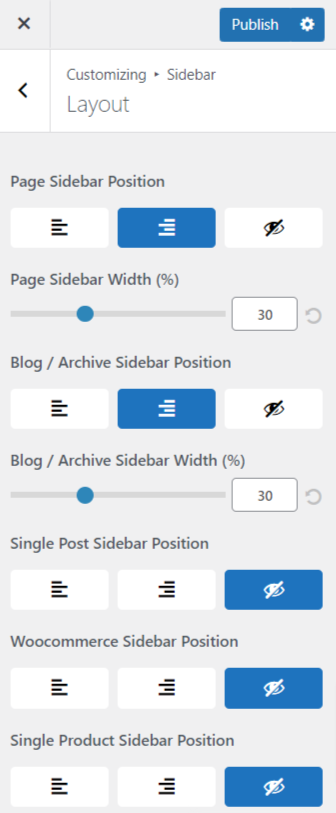
Blog / Archive Sidebar Position – You can select a layout for Blog page from following options
- Right Sidebar – Sidebar will appear on the right side. This is the most traditional way to show sidebar content.
- Left Sidebar – Sidebar will appear on the left side and the main content will be on the right side.
- No Sidebar – Sidebar will not be present and the content will span across entire container width.
Single Post Sidebar Position – You can select a layout for single post pages from following options
- Right Sidebar – Sidebar will appear on the right side. This is the most traditional way to show sidebar content.
- Left Sidebar – Sidebar will appear on the left side and the main content will be on the right side.
- No Sidebar – Sidebar will not be present and the content will span across entire container width.
Woocommerce Sidebar Position – You can select layout for product page, cart page, and checkout page from following options
- Right Sidebar – Sidebar will appear on right side. This is the most traditional way to show sidebar content.
- Left Sidebar – Sidebar will appear on the left side and main content will be on the right side.
- No Sidebar – Sidebar will not be present and content will span across entire container width.
Single Product Sidebar Position – You can select layout for single product page from following options
- Right Sidebar – Sidebar will appear on right side. This is the most traditional way to show sidebar content.
- Left Sidebar – Sidebar will appear on the left side and main content will be on the right side.
- No Sidebar – Sidebar will not be present and content will span across entire container width.
Typography
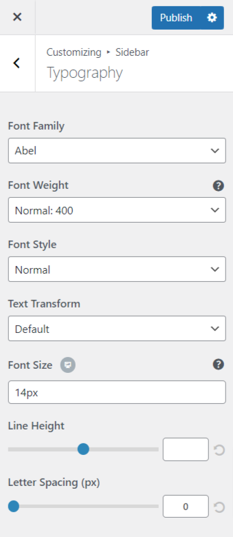
Here you can update overall typography related to Sidebar. You can update following options
- Font Family – Select font family from large number of Google fonts.
- Font Weight – Select font weight.
- Font Style – Select font family style from normal and italic.
- Text Transform – Select between Default, Capitalize, Lowercase or Uppercase.
- Font Size – Select font size.
- Line Height – Give line-height from 1-4.
- Letter Spacing – Give letter spacing upto 10.
Colors & Backgrounds

Sidebar Colors
You can update the colors for the sidebar background, heading, text, links from here.
Footer
Layout
Full Width Footer – Here you can set the width of the footer as full width. By default, the width is set as container width.
Footer Widgets
- Number of Columns – You can select number of footer widgets here.
- Padding – You can give padding to footer here.
- Hide on Desktop – You can hide Footer Widgets on Desktop here.
- Hide on Tablet – You can hide Footer Widgets on Tablet here.
- Hide on Mobile – You can hide Footer Widgets on Mobile here.
Footer Bar

Update Default Copyright Text
- Copyright HTML – Provide the Custom Copyright text to change the default text. You can also give a link to the text here by writing HTML.
- Hide Copyright Icon & Year – Check this checkbox to hide the default copyright icon & year.
- Open Powered By link in new tab – You can open the copyright text in a new tab if you select Yes.
- Hide Copyright on Desktop – Check this checkbox to hide the copyright text on desktop.
- Hide Copyright on Tablet – Check this checkbox to hide the copyright text on tablet.
- Hide Copyright on Mobile – Check this checkbox to hide the copyright text on mobile devices.
- Layout- Here you can select a layout from two options:
- Horizontal – In this layout, the items will appear side to side.
- Vertical – In this layout, the items will appear below each other.
- Padding – Here you can give padding for the footer bar.
- Border Size – Here you can give increase or decrease the top border width for the footer bar.
Social Links
Open Social Icons in a new tab – You can open the following social links in a new tab if you select Yes.
You can provide links for following social icons if you want to display them
- Youtube
- Google +
- RSS Feed
- StumbleUpon
- Vimeo
- Yelp
- Foursquare
- Email Address
Colors & Background
Here you can set Footer Background Color, Text Color, Links Color & Links Hover Color.

Typography
Here you can update overall typography related to Footer. You can update following options
- Font Family – Select font family from large number of Google fonts.
- Font Weight – Select font weight.
- Font Style – Select font family style from normal and italic.
- Text Transform – Select between Default, Capitalize, Lowercase or Uppercase.
- Font Size – Select font size.
- Line Height – Give line-height from 1-4.
- Letter Spacing – Give space between letters upto 10.

Scripts
Embed a script into website’s footer from here.
Scroll to top

Enable Scroll to Top – Enable Scroll to top feature from here. You will see an icon on scrolling down the page which will take you to the top of the page.
Display On – Select where you want to display the icon; Desktop, Mobile, or both Desktop + Mobile.
Position – Select the position of the icon as left or right.
Icon Size – Increase or Decrease the size of the icon from here.
Border Radius – Increase or decrease the border radius of the background.
You can also change the color of icon and background of the icon.
WooCommerce
WooCommerce Integration Overview in Responsive Theme
Responsive theme integrates nicely with WooCommerce. All WooCommerce elements automatically adapt to the rest of your Responsive theme powered website and take colors, fonts out of the box from the theme customizer settings. That way, you can have your shop up and running immediately with minimum setup. Let’s take a look!
WooCommerce options
Please be sure you have WooCommerce plugin installed. Once you have it installed, you will find a dedicated tab for WooCommerce under the customizer.
Store Notice
You can use this feature to show sitewide notice / promotion to users.
Product Catalog
Using this feature you can select what you want to display on shop page, category pages, product sorting, products per row & rows per page.
Product Images
You can update width and height of product images & thumbnails using this option. Using this feature you can select ratio to crop thumbnail images.
Checkout
You can update settings for ‘company name’, ‘address line 2’ and ‘phone’ fields on checkout page using this option. You can decide to make those fields hidden, optional or required. Here you can set Privacy policy page and Terms & Conditions page. Under Privacy policy you can provide text which will be displayed to users on checkout.
Main Content Width – Increase or decrease the width of the checkout page.
Checkout Form Width – Increase or decrease the width of Checkout form.
Product Catalog Options
Layout
Main Content Width – You can select the width of the content here for product page.
Shop Product

Catalog View – You can select tif you want to display the products in a grid or in a list here.
Content Alignment – Here you can choose if you want to display the content at left, right, or center.
Shop Elements – Here you can set the order of Title, Category, Price, Ratings, Add to Cart and Short Description in which they appear. You need to drag the elements to change their order. Also you can toggle click on the eye icon in front of each element to show / hide that element on page.
Sale Notification – You can select from different types of sale notifications designs to add sale bubble on shop and product pages.
- None – No sale notification.
- Default – Default WooCommerce notification.
- Custom String – You can provide any string here which will be displayed as sale notification. To display discount percentage of product keep ‘-[value]%’.
Sale bubble style – You can select one of the style for sale notification from following options
- Circle – Filled circle.
- Circle Outline – Hollow circle with colored outline.
- Square – Filled square.
- Square outline – Hollow square with colored outline.

Off Canvas Filter
Enable Off Canvas Filter – Enable the off canvas filter area where WooCommerce related widgets can be added.
Off Canvas Filter Button Text – Provide text which will be displayed on Off Canvas Filter Button.
Enable Off Canvas Close Button – Enable this option to display close button along with Off Canvas Filter
For Off Calnvas Filter following colors can be cutomized
- Close Button Color
- Close Button Hover Color
- Filter Buton Color
- Filter Button Text Color
- Filter Button Border Color
- Filter Button hover Color
- Filter Button Text hover Color
- Filter Button Border hover Color
Colors & Background
- Rating Color
- Price Color
- Add to Cart Button Color
- Add to Cart Button Text Color
- Add to Cart Button Hover Color
- Add to Cart Button Hover Text Color
- Sorting Options text Color
- Sorting Options background Color
Product Options
Layouts
Main Content Width – You can select the width of the content here for single product page.
Product Elements
Gallery Layout – Here you can change layout for displaying product gallery images.
- Horizontal – This is the default layout in which images from product gallery are displayed below the main image.
- Vertical – With this option product gallery images will be displayed to left of the main image in vertical fashion
Single Product Structure – Here you can set the order of Title, Category, Price, Ratings, Add to Cart, and Short Description in which they appear. You need to drag the elements to change their order. Also, you can toggle click on the eye icon in front of each element to show/hide that element on the page.

Floating Bar
Display Floating Bar – You can hide/display add to cart floating bar from here.
Note – Add to cart floating bar will be visible on single product page after scrolling past the entry summary.
You can also set colors for various parts of the add to cart floating bar.
Background Color – You can use this option to set background color for the entire floating bar.
Title Color – You can use this option to set the font color of ‘Selected’ and title text.
Price Color – You can use this option to set the font color of price text.
Cart Options
Layout
Enable Cross-sells – You can enable/disable cross-sell products from here.

First you have to select products for cross-sells in WooCommerce > Edit Product > Linked Products. Products selected as cross-sells will appear in cart when user adds the edited product in the cart.

Main Content Width – You can select the width of the content here for cart page.
Cart Icon Visibility – Enable or disable the cart icon visibility on all devices. If enabled cart icon will be displayed in the primary menu. Make sure that you have set the Primary Menu otherwise cart icon will not be displayed. With Responsive Plus Plugin, If the cart icon is set to be displayed on all devices, you can update cart icon, style, color & select if wish to display total cart value alongside mini cart icon.

Colors & Backgrounds
Here you can change the button text color, button background color and hover color for Cart Buttons and Checkout Buttons.


